Ayla Home
Online store for aluminum profiles and building products
Oct 1, 2025
From linear light profiles and aluminum cornices to stair treads and doormats — a long-established store in the construction industry.
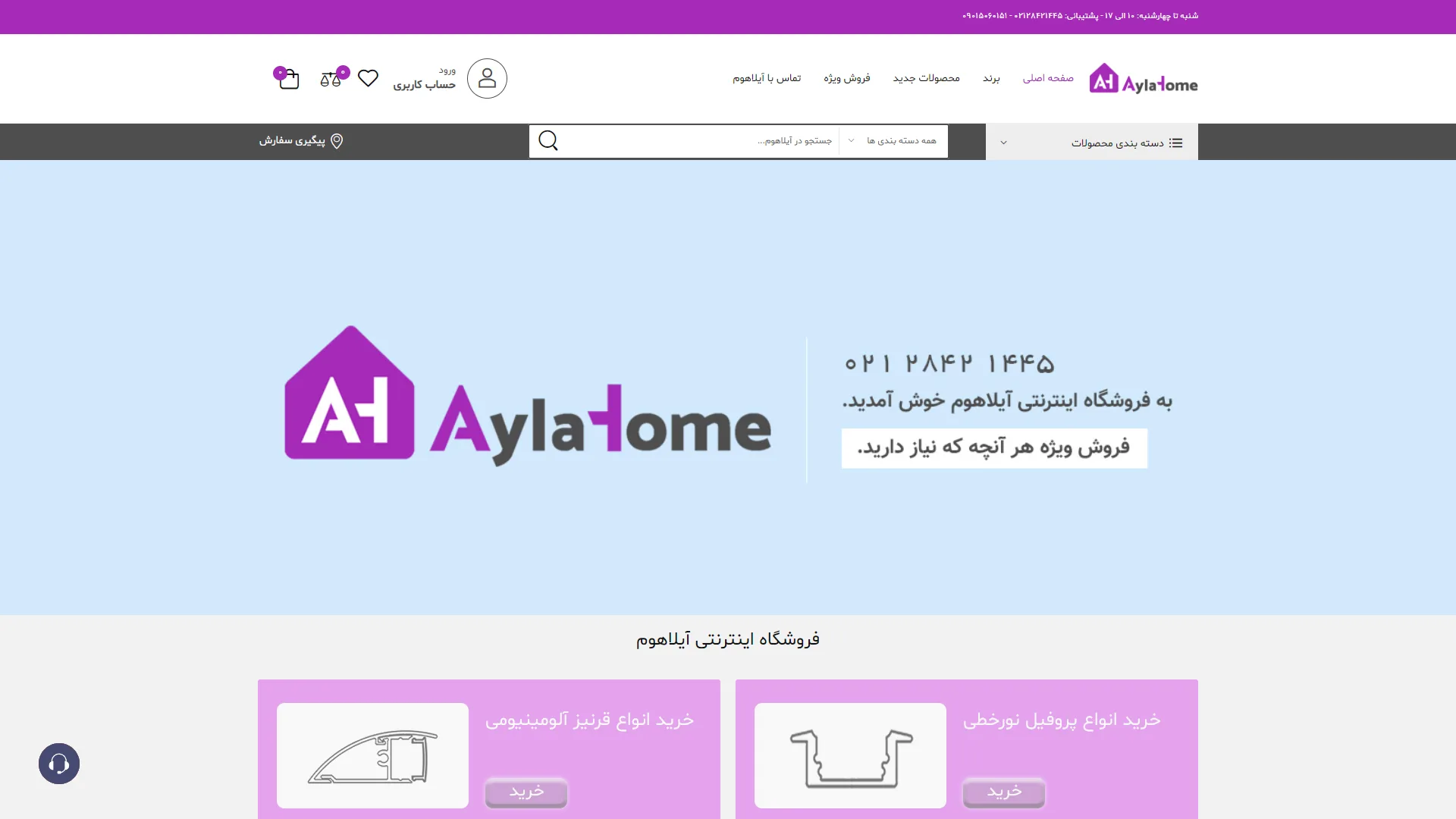
This page showcases the header section of an e-commerce website. It features a bright, minimal aesthetic with a strong focus on decorative products, utilizing a purple and gray color palette to establish a distinct visual identity.
Does the navigation structure and site header provide users with quick access to key sections?
In a standard header, access to main menus, the search engine, and contact information should be immediately apparent. In this section, the top toolbar—with its distinctive purple logo, organized text menus, and prominent search box—performs well, although the dense layout of user icons in the left corner could be designed to feel a bit more fluid.
How can the top banner be leveraged to quickly communicate the brand's identity and values?
The main banner should immediately inform the audience about the services offered and display contact numbers or the core slogan legibly. Here, the soft blue background, paired with a large logo, readable phone number, and advertising slogan, creates a balanced visual appeal that conveys a sense of trust.
Are the product category cards at the bottom of the page engaging enough to encourage clicks?
The product categorization, using purple cards with simple line art and clear "Shop" buttons, follows an organized visual structure that encourages further exploration. However, replacing the line drawings with more realistic imagery could significantly enhance the visual appeal of this section.
Overall, the harmonious color scheme, clean layout, and clever use of white space provide a pleasant, clutter-free experience for users upon entering this online store.
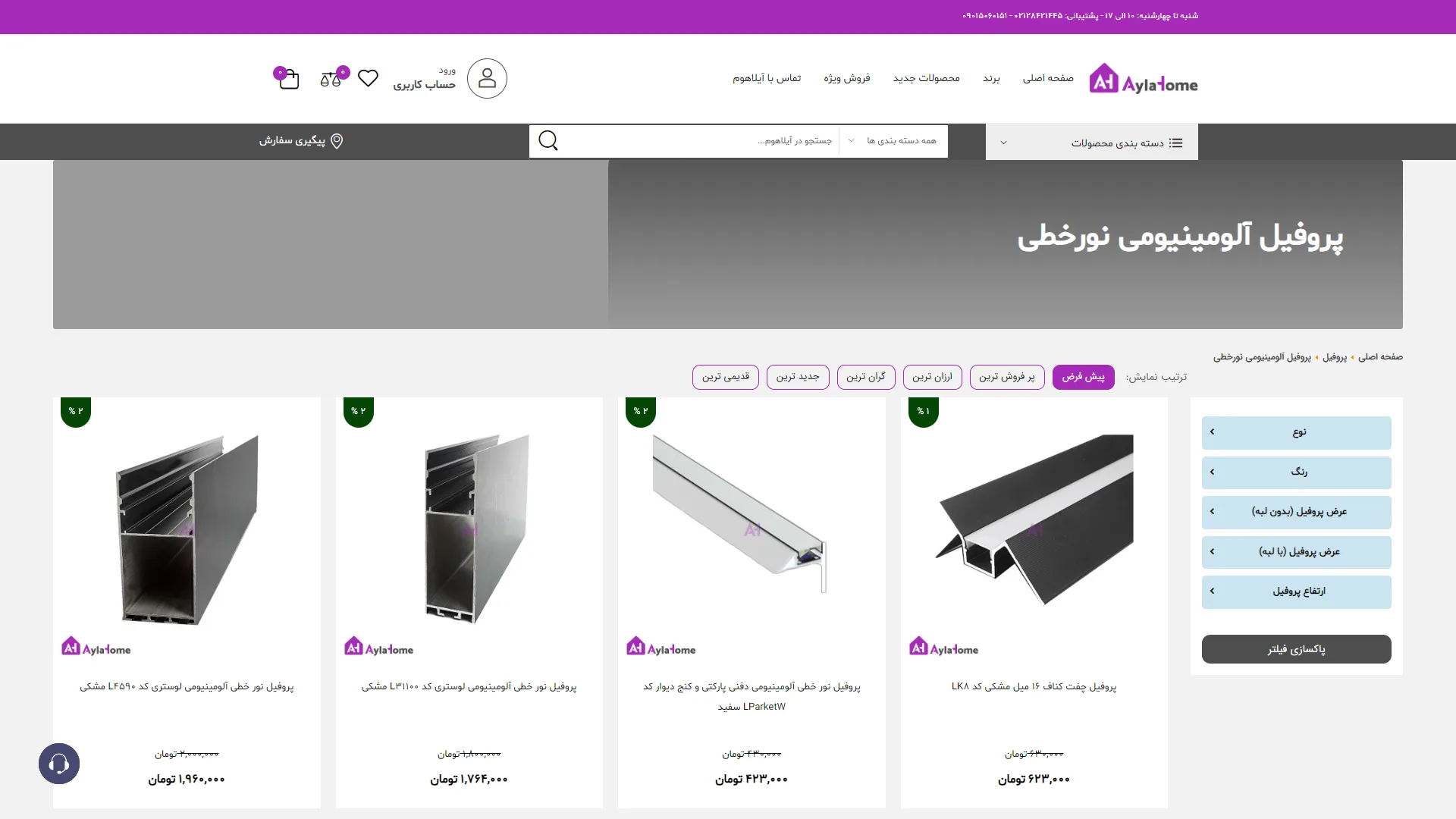
This page is a specialized online store that uses a purple and white color palette to create a modern, structured environment for browsing products.
How can products in this category be found more quickly?
In an efficient store, users should be able to easily locate the products they want using precise filters and practical sorting options. Here, the filter sidebar on the right—featuring options such as type, color, and dimensions—along with the sorting buttons at the top, provides excellent quick access, although the top banner area could have been designed more dynamically to enhance the page's visual appeal.
Are the pricing and discount details clear enough?
Prices should be displayed in a way that makes comparison simple for the buyer, and discount labels should grab their attention. In these product cards, the green discount badges in the corner of the image and the clear distinction between strikethrough prices and final prices in a bold font make readability and understanding discounts very fast and easy.
Overall, the visual structure of this page, with its organized grid layout and clear navigational elements, provides a smooth and unambiguous shopping experience for the customer.
Ayla Home is a well-established store (since 2016) in the field of aluminum and decorative building equipment; offering various aluminum profiles and linear lighting, aluminum cornices, stair treads, doormats, sealing brushes, and parking equipment. In this project, I was responsible for technical support and developing new features using HTML, CSS, JavaScript, jQuery, Bootstrap, and PHP Laravel with Blade Template Engine.
Visit the site: aylahome.ir