Digistation
Online store for gadgets and smart digital products
Dec 25, 2024
From smartwatches and fitness bands to robotic vacuums and IP cameras — a hub for brands like Xiaomi, Anker, and Gltich.
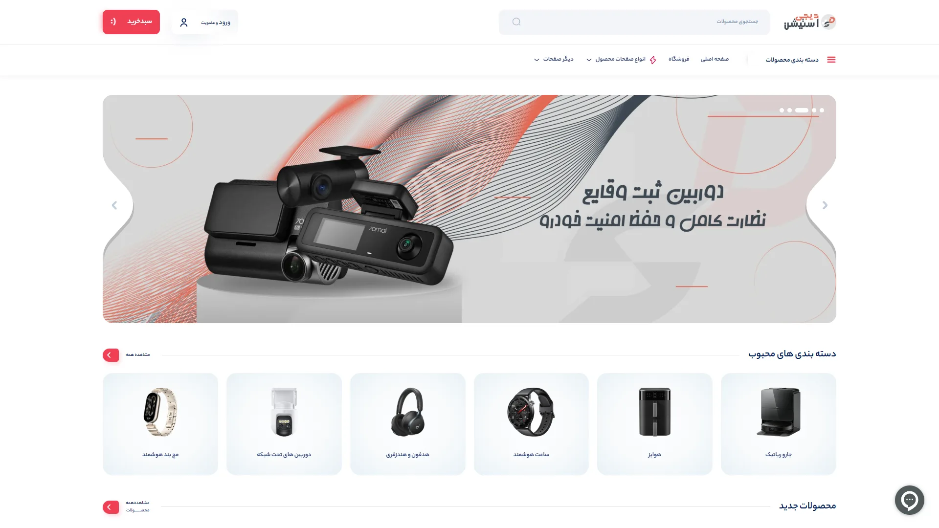
This section showcases the top and key view of the homepage of an online digital goods store, characterized by a clean composition, controlled negative space, and a neutral color palette accented with prominent red hues that establish an identity.
Can the main slider immediately guide the user towards action?
In a modern online store, the hero banner must not only showcase the product but also shorten the buying path with a clear call-to-action (CTA) button. Here, the 3D image of a car camera and the eye-catching typography of 'Dashcam' create a powerful visual impact that captures attention in the first second; however, the absence of a direct button like 'View and Buy' within the banner frame is felt, and relying solely on the clickability of the entire image may reduce some users' interaction.
How much does the layout of categories help in quickly guiding the audience?
Popular category cards in the lower row, with a soft and blurred background, rounded frames, and high-quality images without context of the gadgets, elevate readability and browsing speed. The clear separation of titles such as Smartwatch, Wireless Headphones, and Robot Vacuum facilitates the audience's decision-making, although adding the number of products or a more noticeable hover effect could provide a richer sensory feedback to the user experience.
How well does the header and navigation bar serve accessibility?
The website header has kept vital access points readily available through the smart separation of a wide search bar, a minimalist login button, and a distinct red shopping cart indicator in the left corner. The placement of the category menu with a hamburger icon alongside the main page links organizes navigation and prevents visual clutter in the user's highest point of view.
Overall, we face a balanced, modern structure with a high focus on visually introducing products that effectively conveys a sense of trust and technology orientation to the buyer.
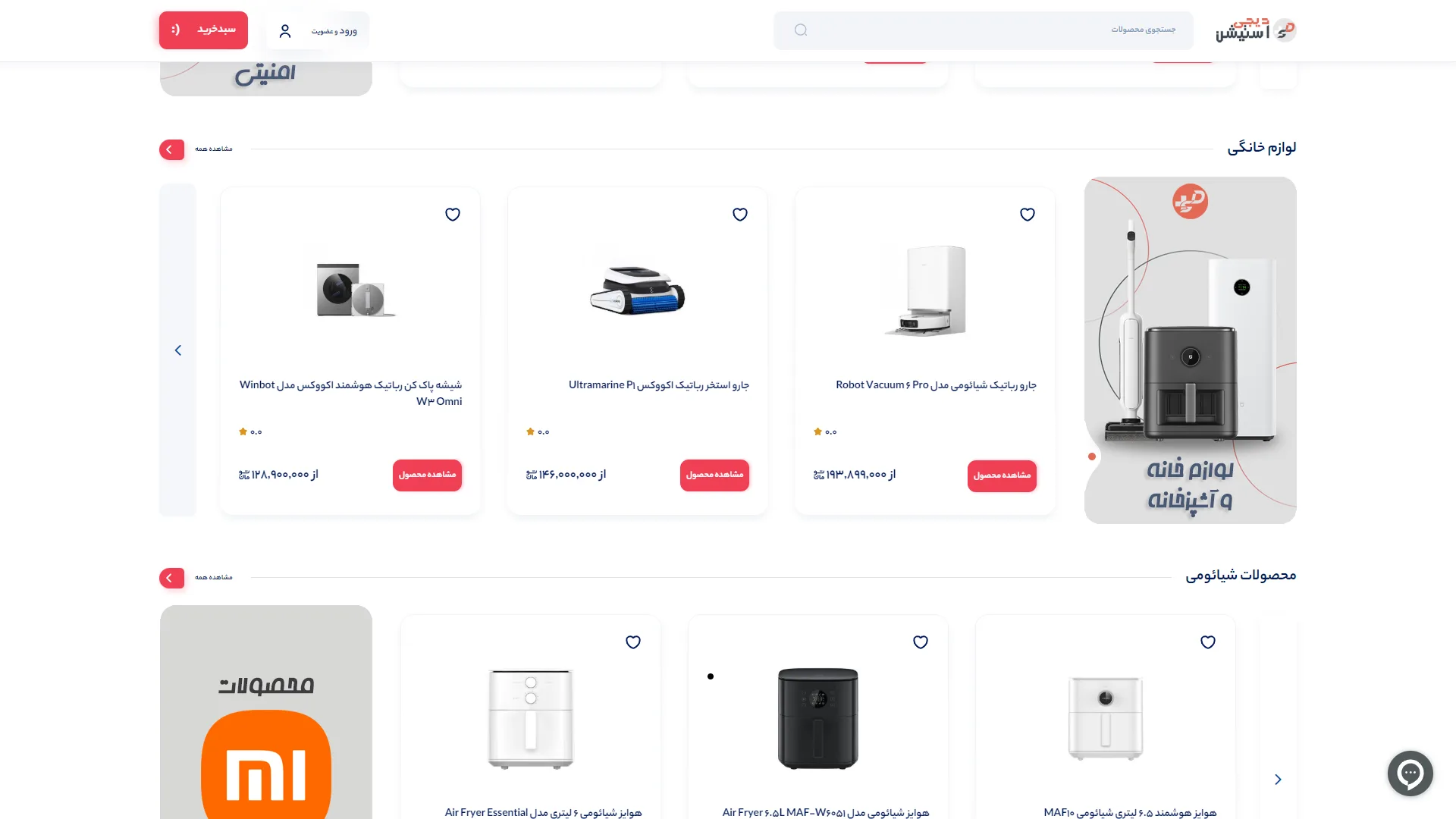
This view illustrates the showcase and categories of the homepage of a modern online digital goods and home appliances store, organized with a minimalist approach, bright spatial design, and a focus on product cards.
Does the product card structure convey information without visual clutter?
In store design, the product card should quickly distinguish key information such as a high-quality image, clear title, price, and call-to-action button while maintaining simplicity. Here, the arrangement of the cards with gentle rounded edges, a solid white background, and very clean red view product buttons is well executed; however, the empty star rating (with a value of 0.0) for all items seems a bit repetitive, and the size of some images could be slightly larger relative to the overall dimensions of the card to make product details stand out more.
How do the identity of categories and hierarchy of sliders encourage users to explore?
The use of prominent vertical banners at the beginning of each row—such as the vertical box for "Home and Kitchen Appliances" and the orange Xiaomi brand banner—acts as an excellent visual anchor and immediately clarifies the theme of the row for the user. The carousel navigation arrows on the sides and the quick access buttons for "view all" also create a smooth horizontal scrolling flow that guides users to browse more products without a feeling of getting lost.
Overall, this section of the user interface provides a modern, clean, and confident environment for swiftly browsing and purchasing smart goods, thanks to its controlled color palette, readable typography, and adequate breathing space.
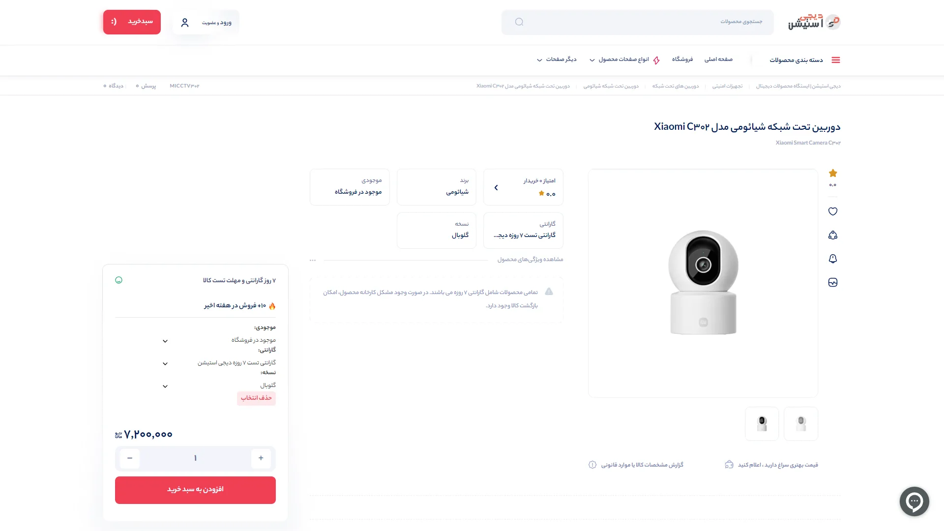
The product detail page (PDP) for an online digital goods store is designed with a minimal structure, extensive use of white space, and an emphasis on red color accents. The right-to-left layout focuses on clarity of technical specifications and a swift purchasing path, allowing users to make decisions without confusion.
How quickly and accessibly is the conversion and purchasing path designed?
In a successful product page, the purchase section should act as a visual focal point, with the final price and warranty status readily visible without additional scrolling. Here, the dedicated purchase card on the left, featuring a bold red Add to Cart button, a quantity controller, and a clear display of the price of 7,200,000 rials, has streamlined the purchasing process significantly; however, the somewhat sizable gap between this card and the product image might slightly reduce visual continuity between the product and the purchase box on wide displays.
Are key specifications and user trust adequately addressed?
A buyer of security and smart devices needs quick information on authenticity, version, and warranty to ensure confidence before delving into technical details. The separation of key specifications like brand, 7-day trial warranty, and global version in light gray and minimal boxes at the center of the page has made information browsing exceptionally easy. However, the lack of ratings and reviews from previous buyers has made the trust-building section appear somewhat sparse and in need of enhancement.
Overall, we are presented with a clean and straightforward user experience that intelligently utilizes red to attract attention and vertical interactive icons alongside the image, creating a modern and standard environment for online shopping.
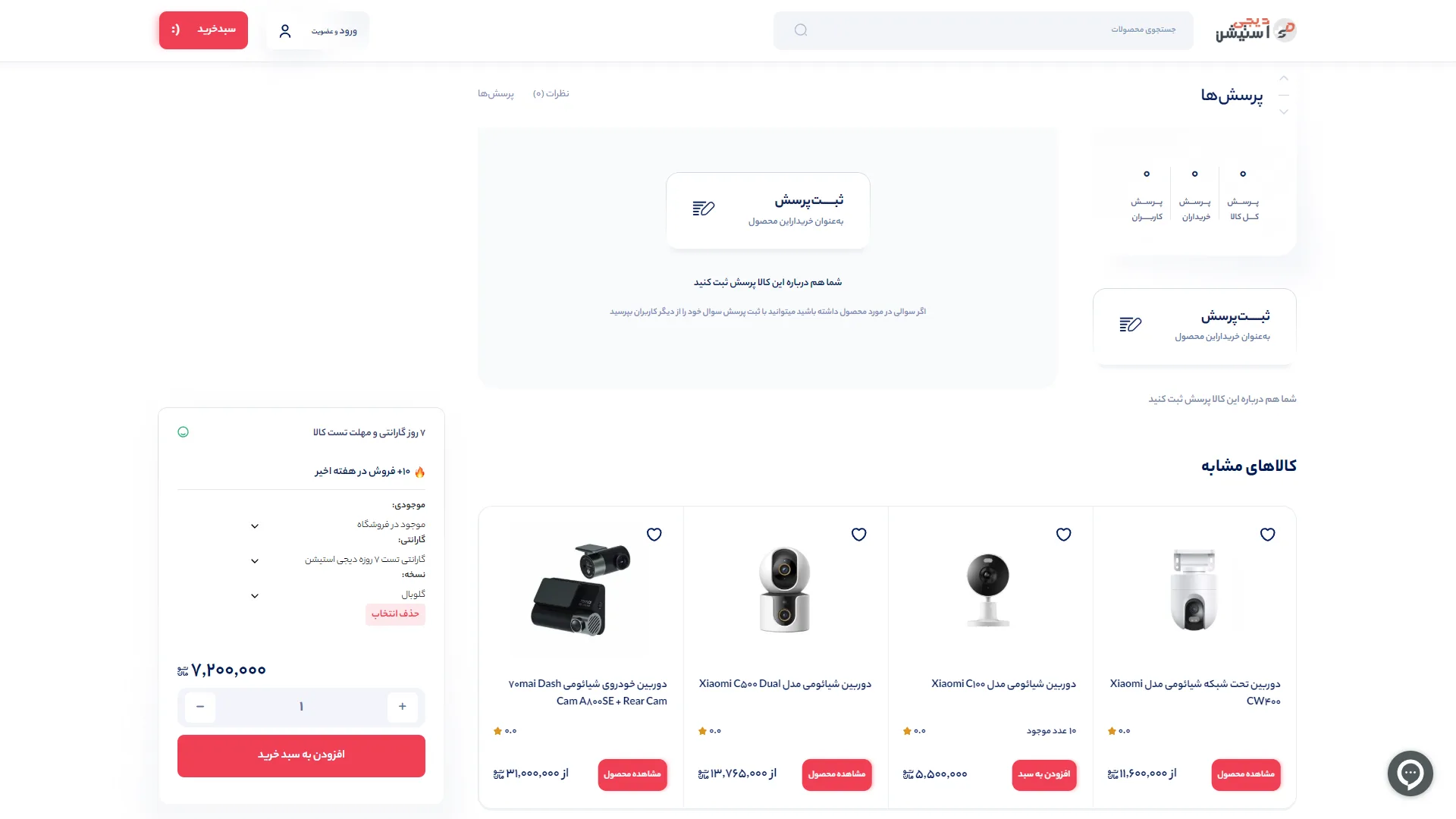
This section of the product page for an online digital goods store focuses on user feedback and offers complementary options with a minimalistic approach based on white space.
Is the user Q&A section designed to be engaging and accessible enough?
The user interaction section should be designed with minimal friction and a clear call to action to encourage hesitant buyers to participate. In this structure, the Ask a Question button and card with a pencil icon draw attention well, but the emptiness in this area and the odd repetition of the question submission card in the sidebar makes the visual weight of the content appear unbalanced; displaying a few sample frequently asked questions in the absence of prior feedback could attract the user's initial trust more quickly.
To what extent do the floating purchase panel and list of similar products aid in finalizing a purchase?
In e-commerce pages, constant access to the main purchase button and quick comparison of similar products play a key role in increasing conversion rates. The left-side purchase card with the prominent red Add to Cart button, clear price display, stock availability, and warranty conditions operates efficiently and reassuringly. Alongside it, the row of similar products with clean cards, clear images from security cameras, price indicators, and distinct call-to-action buttons paves the user's browsing path on the site without confusion.
Overall, with a clean design, high readability of Persian typography, and adherence to standard visual hierarchy, we face a structure that, with better organization of the central question section, will achieve functional perfection.
Digi Station is a specialized store for gadgets and smart digital products; smartwatches, wireless headphones and earphones, IP surveillance cameras, robotic vacuums, and smart home appliances from brands like Xiaomi, Anker, Gltich, Roborock, and Ecovacs. I implemented this project from scratch; the user interface is built with HTML, CSS, JavaScript, jQuery, and Bootstrap, and the back-end runs on PHP Laravel with Blade Template Engine.
Visit the site: digistation.ir