Hydropars
Multilingual corporate website of the Hydropars industrial group
Oct 1, 2025
A website introducing a B2B industrial group in the fields of oil, gas, and water treatment — with dedicated customer portals.
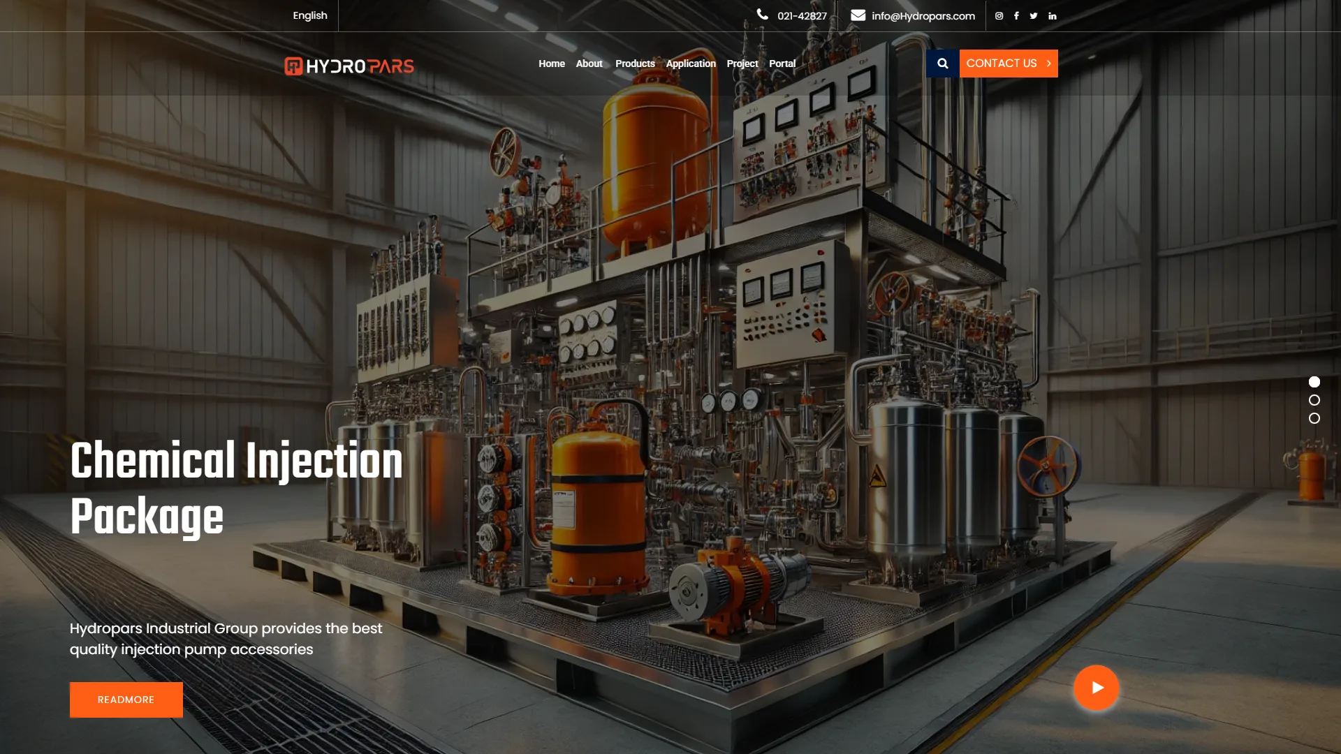
This is the hero section of a corporate website for a heavy industrial engineering firm, designed with a modern structure and a visual identity centered on technological strength. The use of a highly detailed 3D render of chemical injection equipment immediately establishes the business domain and the company's level of expertise at first glance.
How is the balance between technical complexity and readability maintained in an industrial user interface?
In designing B2B engineering platforms, the primary challenge is showcasing technical grandeur and detail without creating visual clutter. In this layout, the purposeful darkening of side layers and controlled lighting ensure that the bold white headline and the orange READ MORE button remain completely distinct and legible. However, the intersection of the complex metallic structures at the top with the main menu text creates a slight visual conflict; adding a semi-transparent dark background to the header could further enhance this separation.
How has the accessibility and interaction path been engineered for industry decision-makers?
B2B audiences in this market place a high premium on time and need the quickest possible access to inquiry and communication channels. Placing the direct contact number and corporate email in the top bar, alongside the prominent CONTACT US button, immediately streamlines the potential customer's decision-making journey. Additionally, the circular video button in the bottom right corner provides a visual incentive to see the system in actual operation.
Overall, by cleverly utilizing the corporate orange against a steely, dark backdrop, this structure blends engineering precision and industrial authority with commercial clarity.
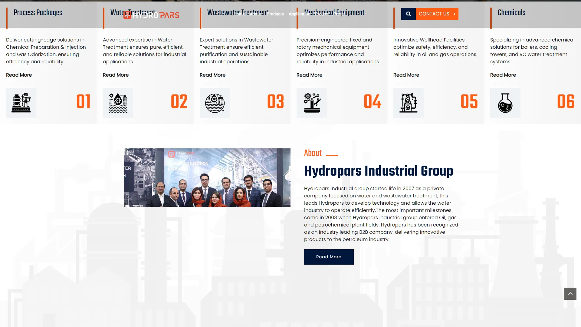
We are looking at a corporate landing page for an industrial firm specializing in petroleum, gas, and refining engineering. It utilizes a multi-column layout with a corporate color palette of dark orange, navy blue, and neutral gray to categorize its various fields of activity.
Does the service categorization effectively streamline the user journey for industrial clients?
In corporate websites, clarity in presenting specialized sectors is paramount, enabling technical decision-makers to find the desired service within seconds. In the top row, the use of six numbered cards with corresponding icons and prominent headings such as Process Packages and Chemicals creates a cohesive and quickly scannable information architecture. However, an unintentional overlap between the navigation menu and some column headers, such as Water Treatment, hinders readability and necessitates a more precise definition of vertical layers and protective spacing.
How does the "About Us" section instill initial trust through the user interface?
Presenting a human identity and a business track record is the core of building trust in B2B transactions. In the lower section, combining a group photo of the staff with the company's history—referencing back to 2007—immediately gives the brand a professional and credible face; although the contrast of the descriptive text against the backgrou
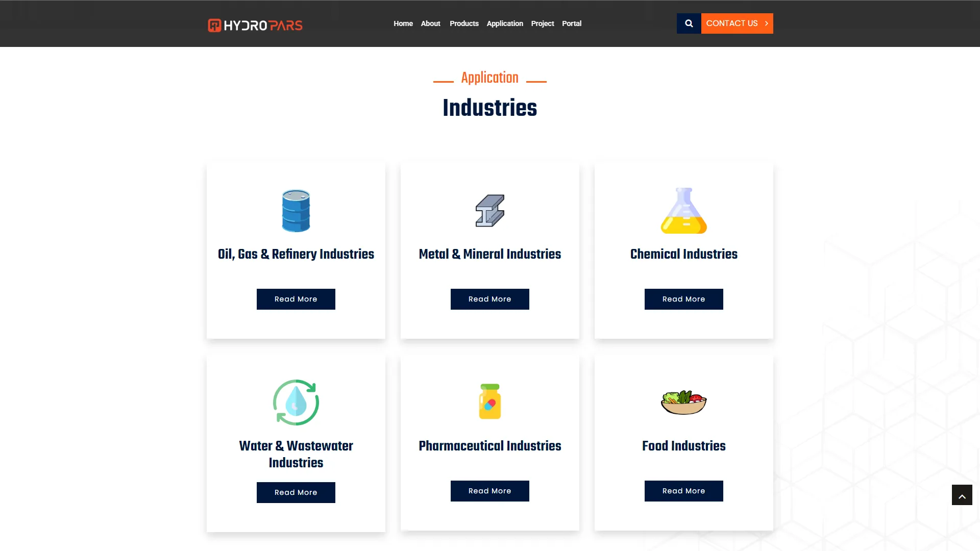
This section is an industry and application fields introduction page for a corporate industrial website. With an organized grid layout and a minimalist structure, it separates the various segments of the target market.
Can an industrial audience identify their relevant field at first glance?
In designing B2B corporate pages, quickly categorizing the audience based on their industry is critical and must be achieved without adding cognitive load. The use of independent cards with soft shadows and bold, dark headings makes distinguishing sectors like oil and gas, mining, and water treatment very easy. However, the use of colorful, whimsical illustrations and icons alongside heavy titles such as "chemical industries" or "refineries" slightly diminishes the serious and professional atmosphere; employing real industrial photography or more technical graphics could have projected greater professional credibility.
How is user behavior managed and guided toward detail pages?
Structured navigation should provide a clear call to action and open deeper site paths without ambiguity. The dark navy buttons labeled Read More within each card create good contrast against the white background and are placed in standard positions. That said, the monotonous repetition of the same generic text across all cards, without referring to industry-specific solutions, misses the opportunity for content previews. Making the entire card area interactive upon hover could have created a smoother user experience.
To what extent have visual consistency and brand identity been maintained?
Harmony between page elements is a high priority in building trust, and the color scheme must follow the core visual identity. The top navigation bar, emphasizing the orange Contact Us button and the Application heading in the same warm tone, achieves proper harmony with the corporate colors. Conversely, the faint geometric pattern in the white background on the right—while an attempt to avoid monotony—appears unbalanced at the margins due to being too faded compared to the solid central cards.
Overall, this layout presents a clear, clean, and efficient industry introduction section that allows users to navigate effortlessly, although refining the visual language of the icons could further enhance the design's sophistication.
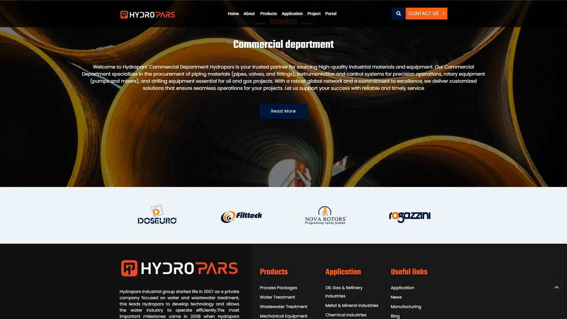
This section is a B2B service introduction page for heavy industry, piping equipment, and oil and gas, utilizing a dark structure, industrial macro photography, and warm color contrast.
Does the visual identity successfully convey a sense of industrial expertise and credibility?
In corporate engineering websites, the user must instantly grasp the scale and gravity of the work through documentary imagery and bold typography. The background image, featuring circular cross-sections of massive industrial pipes with streaks of yellow and dark tones, creates a perfectly relevant atmosphere, while the large, heavy font of the Commercial department heading doubles this visual weight. However, the sharp contrast between the very dark header background and the compact, solid white bar of partner logos creates a harsh visual break that could have been softened with a gentler gradient or a more subtle separation.
How is the text readability and accessibility of calls-to-action evaluated?
A business introduction is effective only when the body text is easily readable against busy backgrounds and call-to-action buttons draw attention. In the top section, the orange CONTACT US button in the navigation bar has the highest contrast and is immediately visible, but the navy blue Read More button remains somewhat hidden within the dark background, lacking the necessary clarity. Additionally, because the introductory paragraph sits directly atop the detailed texture of the piping image, it may require a deeper background overlay or darkening on various displays to prevent user eye strain.
How structured is the footer layout and the trust-building elements?
The multi-column footer structure, with precise thematic categorization including products, applications, and useful links, provides a very convenient secondary navigation for procurement specialists and industrial clients. The row of international brand logos, such as Doseuro and Nova Rotors, displayed on a light bar, tangibly showcases the group's technical credibility and solidifies the hierarchy when transitioning from the introduction to detailed company information.
Overall, through the choice of powerful imagery and a warm, dark color palette, this design creates a serious persona perfectly suited for the oil and energy equipment trade.
Hydropars is a multilingual corporate website of an industrial group that started its operations in water and wastewater treatment in 2007. Today, it stands as a leading B2B company, manufacturing equipment for the oil, gas, and petrochemical industries — ranging from chemical injection packages and wellhead facilities to mechanical equipment and chemicals. In addition to showcasing products and projects, the site is linked to portals like EDMS and customer portals. My responsibility was technical support and the development of new features on the HTML, CSS, JavaScript, jQuery, Bootstrap, and PHP Laravel platform with the Blade Template Engine, with particular attention to the website's multilingual structure.
Visit the site: hydropars.com/en