Laico
Online store for mattresses and sleep accessories
Oct 1, 2025
A specialized store for mattresses and sleep accessories — developed with React and Tailwind CSS.
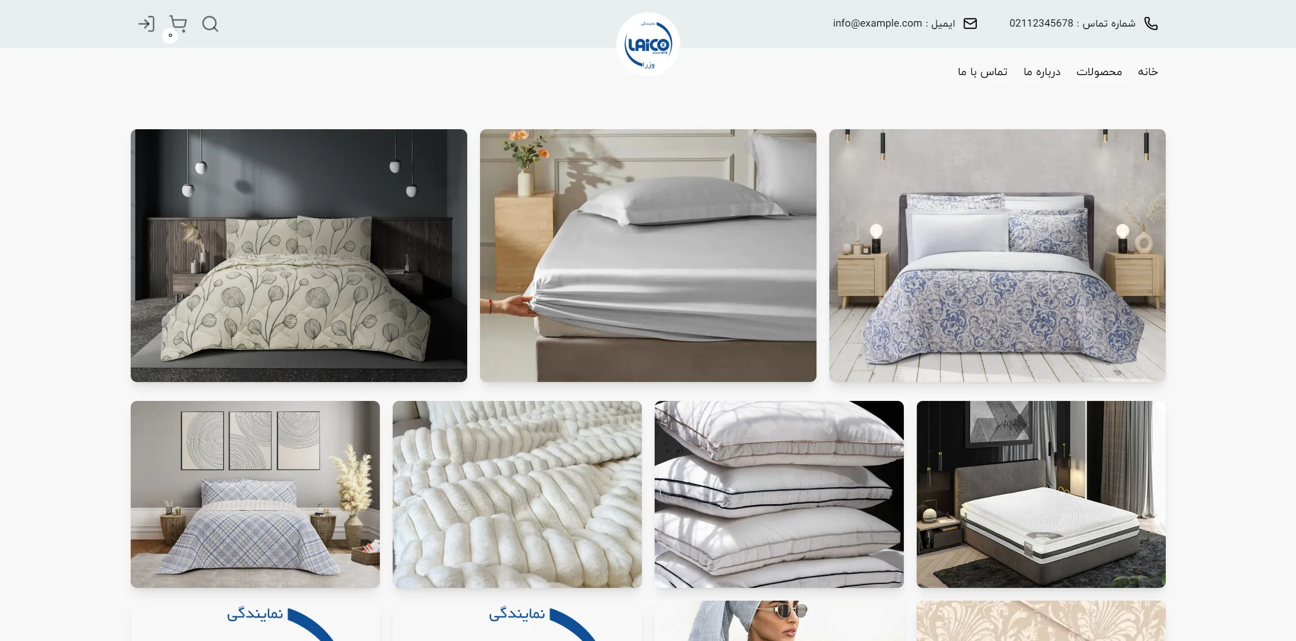
This is the homepage of an online bedding store. By utilizing a stark white background, a centered blue logo, and a grid-based image layout, it creates a minimal, organized, and calming atmosphere for the visitor.
Is the header and navigation menu structure sufficiently legible and accessible?
In a standard commercial header, contact information and email should be visible alongside the primary navigation links with minimal eye strain. On this page, contact details are placed at the top with small icons, and the right-aligned main menu includes Home, Products, and About Us. However, more white space between the contact info and the navigation menu would have been preferable for better visual separation.
How does the product image grid convey a sense of quality and variety to the buyer?
Large images with rounded corners and an asymmetrical yet balanced layout effectively evoke a sense of luxury and comfort for bedding products like quilts, sheets, and pillows. Displaying products in real-life settings and various bedroom decors helps the user better visualize the fabric quality and color coordination, although the absence of pricing or direct purchase buttons in this overview gives the page a catalog-like feel.
Overall, by leveraging a cohesive visual identity, high-quality imagery, and a clean structure, this page has created a chic and attractive storefront for bedding products that guides the viewer's eye toward the variety of goods without causing confusion.
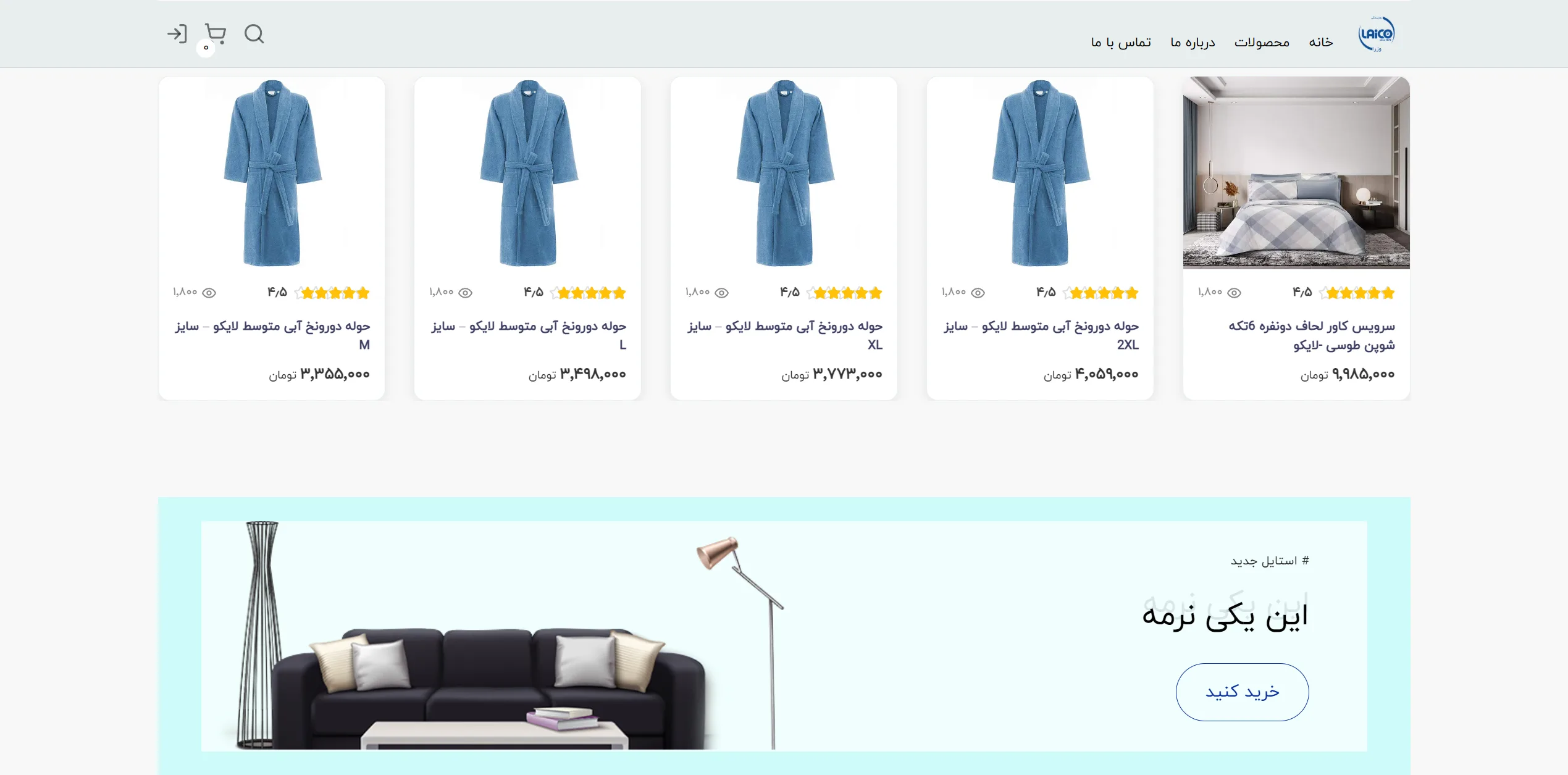
This page features an online store with a minimal design and a structured grid layout, showcasing home textile products such as towels and bedding. The light color palette, clever use of white space, and card-style product borders evoke a sense of cleanliness and serenity for the shopper.
Does the product card structure help customers make quicker decisions?
In a successful online store, a product card should display a high-quality image, customer ratings, a legible title, and the price in a way that allows the user's eye to glide through without confusion. Here, the towel and quilt set cards—with their isolated product photos, yellow rating stars, and clear pricing in Tomans—convey key information to the audience in the shortest time possible. However, adding a direct "Add to Cart" button on the cards could have further improved engagement and conversion rates.
Does the bottom promotional banner succeed in capturing the user's attention?
An effective promotional banner within store pages should stop the user's scroll and entice them to click through engaging visuals and curiosity-driven headlines. The combination of the light blue background, a stylish sofa image, and the rounded call-to-action button on the right creates a pleasing visual harmony that balances well with the top of the page and prevents the site's visual space from feeling monotonous.
Overall, this layout is built on a sound understanding of online shopper behavior, providing a smooth, clean, and enjoyable browsing experience.
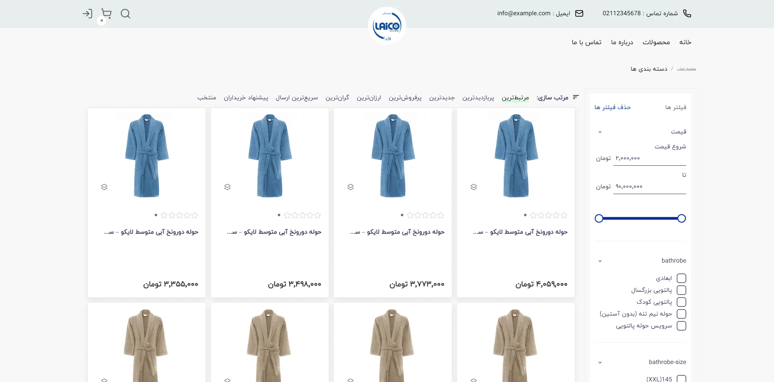
This page is essentially the archive and product catalog section of an online store, designed with a clean and structured layout to allow users to navigate between categories with ease. The ample white space on the page focuses the viewer's attention directly on the product images and prices.
How can we ensure that the advanced filters on the right assist in quicker selection rather than causing confusion?
The filter panel on the right, with its dropdown tools and organized checkboxes, provides a familiar standard for precise searching, speeding up the process of filtering by size and category. However, the price range slider, with its small fonts and simple lines, requires more attention to visual detail to make the interaction more pleasant and seamless for the user.
Do the product cards achieve a proper balance between pricing information, product titles, and images?
The product cards, with their subtle borders and white backgrounds, offer a clean presentation of colorful towels alongside prices in Tomans, maximizing readability. The absence of rating stars or dynamic discount labels is quite noticeable, as their inclusion could significantly increase the incentive for immediate purchase.
What role does the top sorting bar play in guiding the user toward their preferred options?
The horizontal sorting options at the top of the product list, aligned to the right, place several choices such as "Most Popular" and "Cheapest" within easy reach. The use of a soft green for the active option serves as an excellent visual guide, though the spacing between options is somewhat tight, which may hinder touch interaction on smaller screens.
Overall, this user interface, with its classic and minimalist structure, creates a calm and uncluttered shopping experience that could become even more functional with slight improvements to the interactive details of the filters.
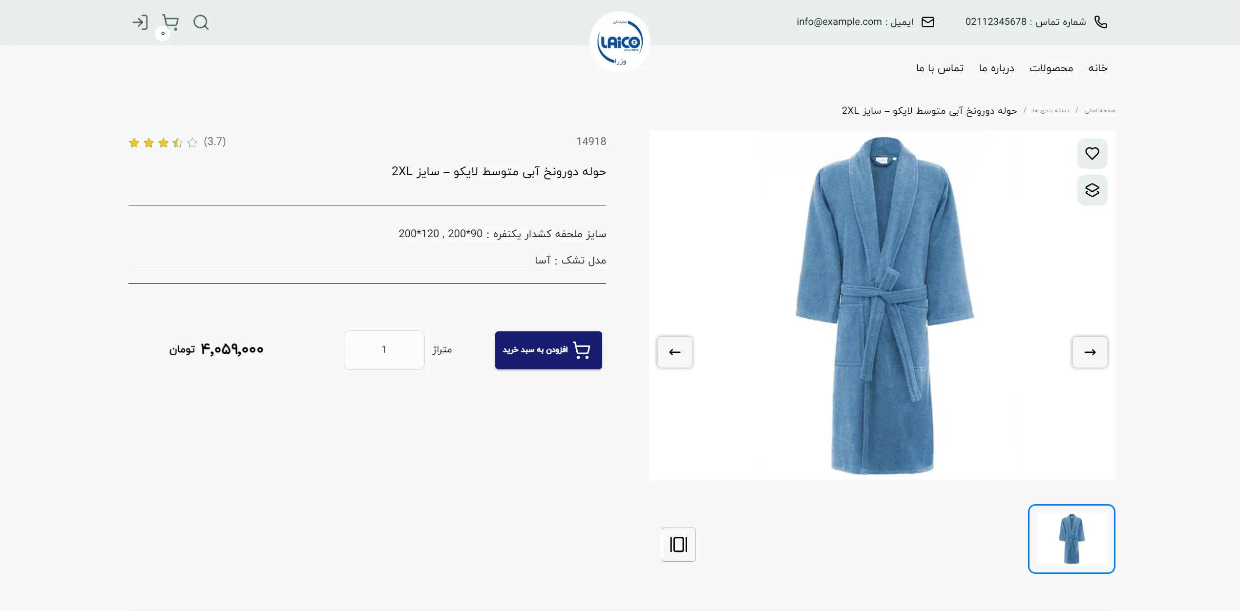
This page is a standard, clean example of a product detail page for an online store. Its two-column layout creates a strong focus on the accurate presentation of the item and purchasing information.
How can the buyer conversion rate be increased on such a page?
A successful product page should place key information—such as price, technical specifications, and the call-to-action button—prominently and directly in front of the user. In this view, the price is clearly legible, and the blue Add to Cart button is placed on the left with suitable contrast, quickly guiding the customer toward a decision. However, adding more images from different angles alongside this button could further increase buyer confidence.
What role do visual elements and categories play in guiding the user?
The breadcrumb navigation at the top of the page helps the user keep track of their location within the site structure and easily return to previous pages. The generous use of white space in the background and the product card prevents eye fatigue, ensuring that all attention remains focused on the high-quality image of the blue towel and its textual specifications.
Overall, this minimal and organized layout meets all the primary needs of an online shopper in a clean, distraction-free manner.
Laico is a specialized store in the field of mattresses and sleep accessories, developed with React. User authentication is done using JWT, and I used a combination of Modular CSS and Tailwind CSS to implement the desired user interface for the client.
Visit the site: new.laico.co