Mahsho Beauty
Online store for cosmetics and skincare devices
Jul 1, 2025
Mahsha Shop's sister version focusing on cosmetics and beauty; a showcase of dozens of international brands.
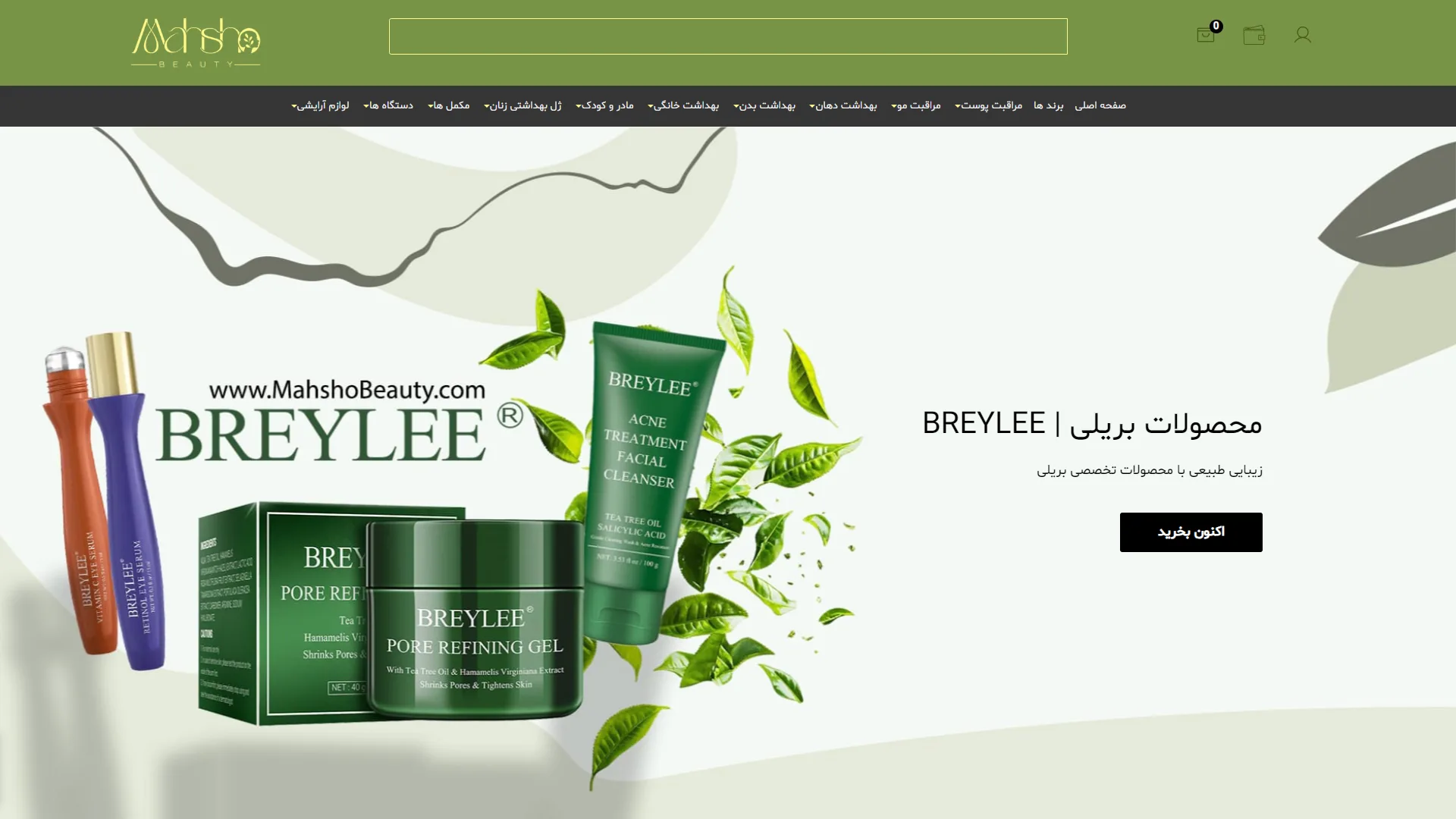
This landing page for an online cosmetics and skincare store uses a soft olive green color palette to convey a sense of freshness and organic authenticity. The visual structure is designed so that users immediately recognize the brand's focus on natural products and skincare.
How do the headline and main text capture the audience's attention?
In a successful commercial landing page, the main headline must communicate the brand's value proposition to the buyer in a fraction of a second and guide them in the right direction. In this section, the brand name "BREYLEE" is paired with a legible font and the slogan "Natural Beauty with Breylee's Specialized Products," which reinforces a sense of trust. The black call-to-action button labeled "Buy Now" creates a nice contrast, although making it slightly larger would have drawn the eye toward the purchase even more quickly.
Why are the graphical elements and product layout effective in this section?
Product imagery in the hero section should evoke dynamism and quality without making the visual space feel cluttered. Here, the placement of green creams and serums alongside green tea leaves and a clean background perfectly evokes the feeling of a botanical, healing product. Furthermore, the appropriate spacing between the text elements on the right and the images on the left ensures a good visual balance, preventing user fatigue.
Overall, through the clever use of nature-inspired soft tones and a clean layout, this design creates a calming environment for a confident skincare shopping experience.
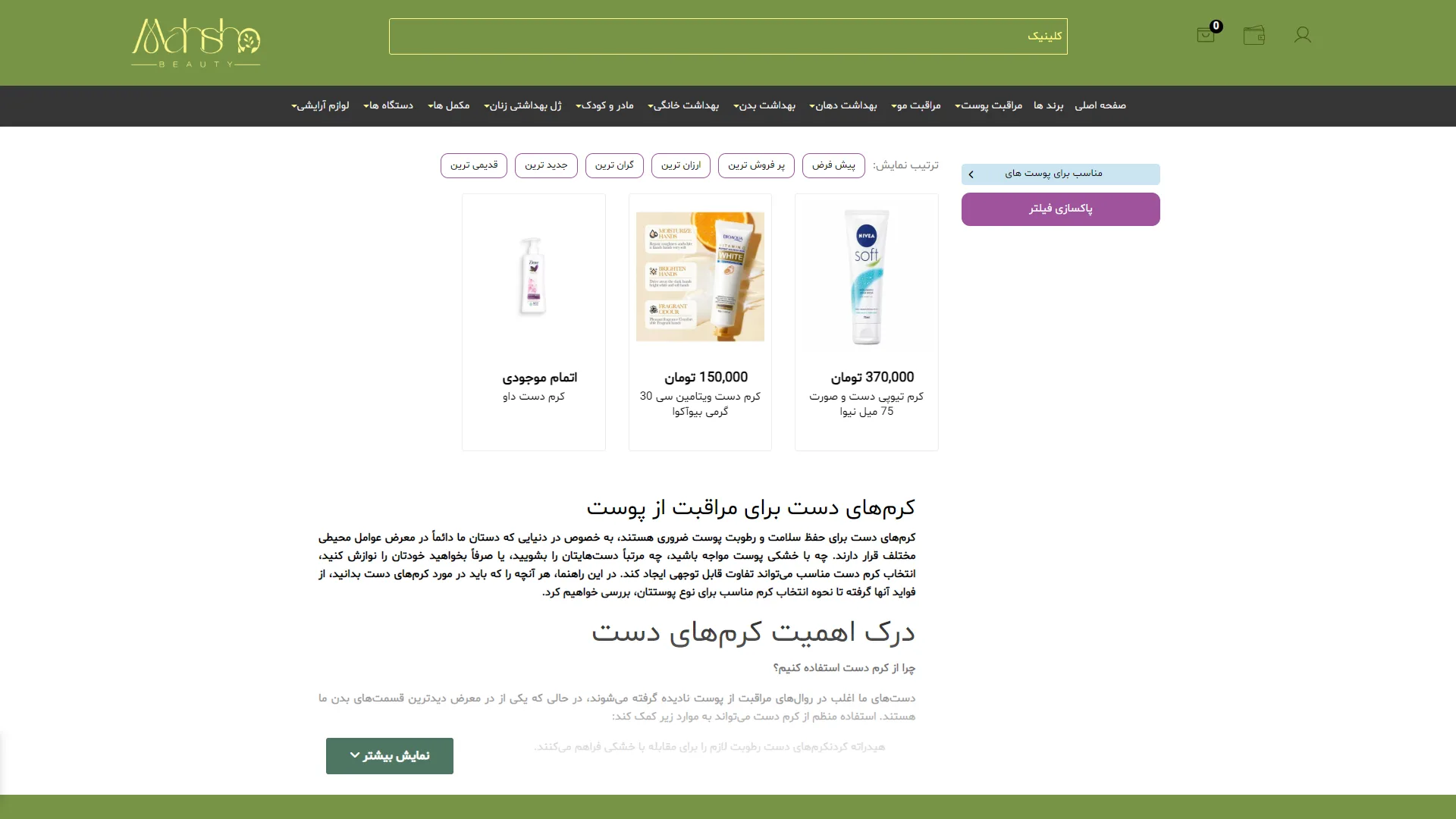
This page is an online store for cosmetics and personal care products. By combining olive green tones with a clean design, it conveys a sense of tranquility and nature to the user. The visual structure—ranging from a comprehensive header with diverse categories to the grid layout of products—creates a smooth and organized online shopping experience.
How do the filtering and sorting systems help users find their desired products faster?
An efficient filtering system should provide quick access to various options such as "cheapest," "newest," and "best-selling." On this page, the top sorting bar with rounded, bordered buttons fulfills this need effectively. Alongside this, the purple "Clear Filters" button and the blue "Suitable for skin types" tags serve as appropriate visual tools for managing filters, although they could have achieved better readability with slightly more padding from the edges.
How do product images and pricing influence the customer's decision-making?
Product images are set against a white background within card-like frames, drawing the eye's focus directly to the packaging, with prices listed in a legible font below each image. However, the "Out of Stock" label on the product to the left is black and somewhat plain; it might have been better to align it more closely with the site's color palette to create a more cohesive visual feel.
What role does the content section at the bottom of the page play in guiding the audience?
The presence of guide and educational texts at the bottom of the page significantly aids in SEO and customer awareness. The use of legible typography with clear headings makes reading this lengthy section easier. The dark green "Show More" button at the bottom, featuring a downward arrow, is an effective call-to-action for revealing hidden content; however, the gray text on the white background further down appears a bit too faint and requires more effort to read.
Overall, by leveraging e-commerce UI design principles, this page strikes a good balance between presenting a product catalog and providing educational content, offering the audience a simple and clutter-free journey.
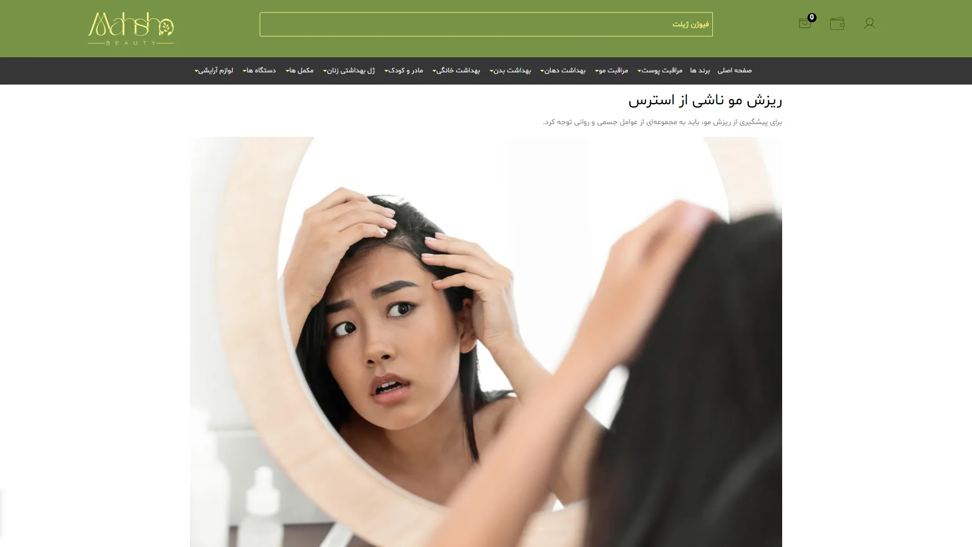
This page showcases a specialized blog article in the field of hair health and beauty. With an olive green and dark gray color palette, it evokes a sense of calm and naturalness for the audience. The overall structure of this section is designed to address the user's primary concern directly, providing a minimal and clutter-free space for reading.
How can the site header and navigation bar improve user accessibility?
In a standard design for online stores and specialized magazines, the top menu should present categories in a segregated and organized manner to eliminate the need for complex searches. In this view, the dark horizontal menu with a legible font and small arrows facilitates access to various sections such as hair care, skin, and home hygiene, although the high density of options in a single line may initially pose a challenge for mobile users.
What is the role of imagery and main headings in attracting and engaging the audience?
An impactful article must create a sense of empathy and acknowledge the user's problem within the first few seconds through a relevant image and a bold headline. The large image of a woman looking concerned about her hair loss in the mirror is emotionally linked to the title "Stress-Induced Hair Loss," and the short text below, with proper layout and sufficient white space, guides the reader's eye toward the main body of the text.
Why is the use of functional UI elements in the header important?
The presence of quick-access buttons such as the shopping cart, wallet, and user profile in the top corner is a requirement of modern e-commerce that simplifies the interaction process for the customer. In this image, these icons, along with a wide search box with rounded corners, are set against an olive green background, creating good visual separation, though the search bar's position could perhaps have been more prominent.
Overall, by blending emotional imagery, clean typography, and a structured header, this section of the site has succeeded in creating a trustworthy and intimate environment for delivering educational and specialized content.
Mahsha Beauty is a complementary store to Mahsha Shop, focusing on cosmetic products, skincare, and beauty care devices; brands like COSRX, Bioderma, Isdin, and La Roche-Posay are part of its showcase. In this project, I also provided technical support and developed new features based on HTML, CSS, JavaScript, jQuery, Bootstrap, and PHP Laravel with Blade Template Engine.
Visit the website: www.mahshobeauty.com