Niksan
Niksan Online Home Appliance Store
Apr 1, 2025
Refrigerators, televisions, and air conditioners from the brands Niksan, Alteto, Renzo, and Suzuki — with installment purchases and no down payment.
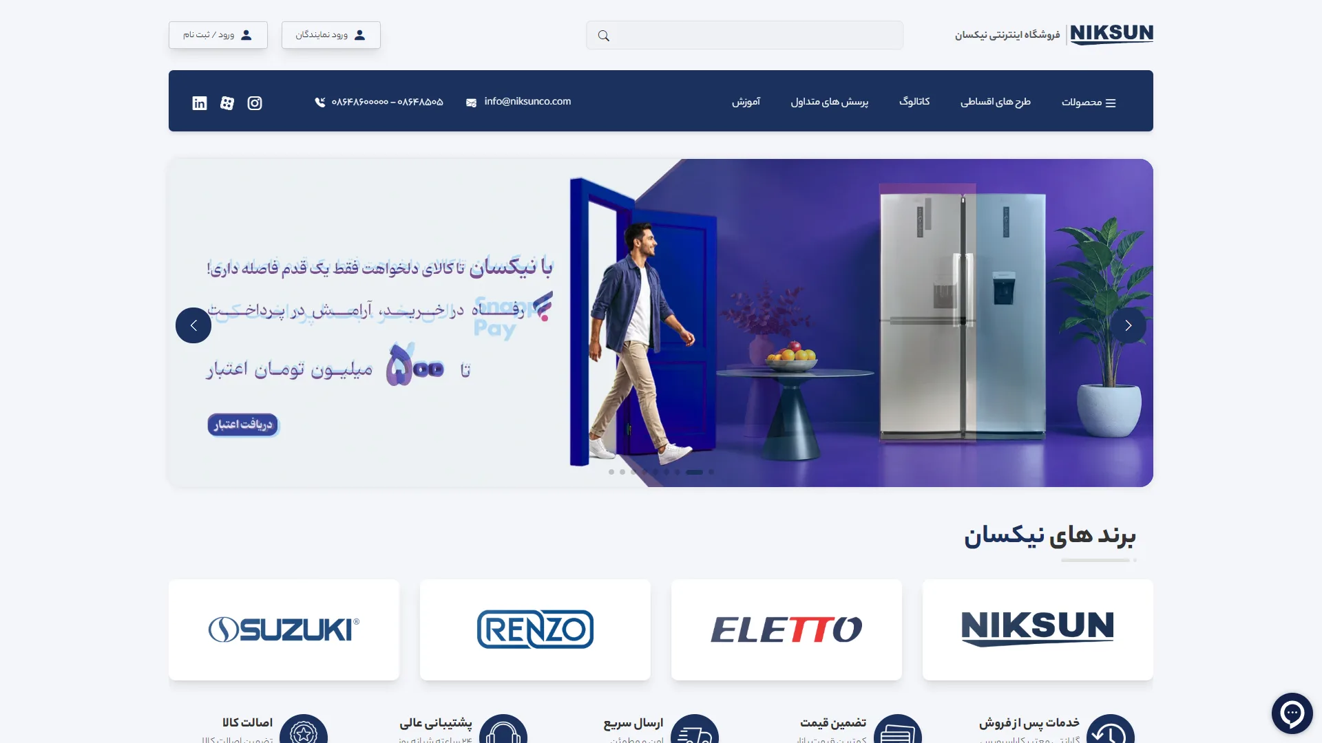
The hero section of this home appliance online store features a structured, clean layout with a coordinated navy and blue color palette, designed to establish brand identity at first glance.
To what extent does the header and navigation facilitate quick access to products and information?
In large online stores, the header must strike a smart balance between product search, user account access, and communication channels. The inclusion of a dark toolbar featuring direct contact info, email, and social media links alongside key links like "Installment Plans" creates a strong sense of formality and credibility. However, the central search bar at the top of the page is set against a very light, low-contrast white background; strengthening its borders or dimensions could have made the search call-to-action more prominent for the hurried shopper.
How does the main slider banner place the value proposition center stage?
The opening slider requires a clear financial message and a tangible lifestyle visual to justify the purchase of big-ticket items in the customer's mind. The combination of a blue graphic background, the display of a modern refrigerator, and a focus on SnapPay installment plans with bold typography immediately addresses the mental barrier of high pricing. The "Get Credit" call-to-action button is ergonomically well-placed, although its color contrast against the blue background could have achieved more warmth and a better click-through rate by using a complementary color like orange or yellow.
What role do the brand architecture and trust indicators below the slider play in decision-making?
The sleek, separate cards with rounded corners used to display sub-brands like Suzuki, Renzo, and Alto, alongside the parent brand, create a clean visual separation that simplifies brand-based browsing. Furthermore, the trust and service icons—such as authenticity guarantees and fast shipping—prominently displayed at the bottom of the page thoughtfully complete the chain of trust before the user enters the product catalog.
Overall, we are presented with a legible, balanced, and professional environment that, through a calculated arrangement of elements and effective use of white space, has created a secure and reliable framework for e-commerce.
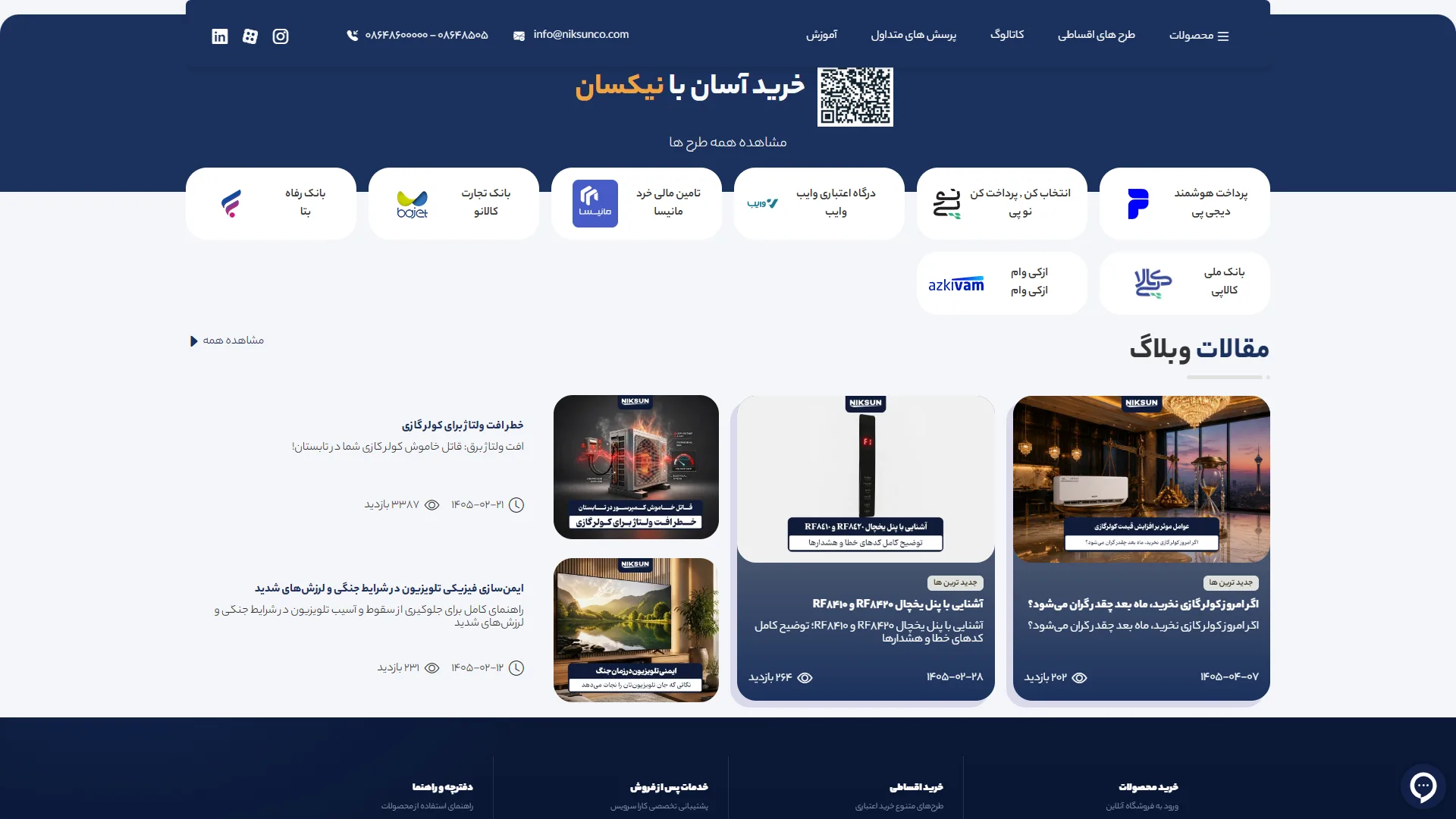
This section of a corporate and home appliance e-commerce homepage, featuring a dark navy and white color palette, focuses on introducing credit payment options and the latest educational articles.
How does a variety of installment options help build buyer trust?
When selling durable and relatively expensive goods, highlighting credit options is one of the most critical factors in reducing a user's purchase hesitation. Here, white capsules with fully rounded corners set against a navy background create a uniform and organized layout for introducing payment gateways and credit facilities such as DigiPay, AzKVM, and Tejarat Bank. The separation of logos and brief descriptions under each provides a clean readability to this block; however, the alignment of the second row—containing only two options—slightly disrupts the visual symmetry compared to the top row and could have achieved a more harmonious form with a tighter grid layout.
Does the articles section strike the right balance between content marketing and user guidance?
Strong landing pages typically present blog content not merely as SEO text, but as a tool to address a customer's technical concerns and decision-making process. In this section, the asymmetrical division between the vertical image-centric cards on the right and the denser text list on the left keeps the eye moving, while metadata labels such as publication date and view count help in assessing the popularity of the content. That said, the font size of some headings in the navy cards below the images is slightly too large and cramped; giving the title typography more breathing room would have made the content hierarchy more legible and polished.
Overall, by leveraging sharp light-dark contrast and focusing on financial facilities, this structure presents a professional and practical image of the brand's service ecosystem to the audience.
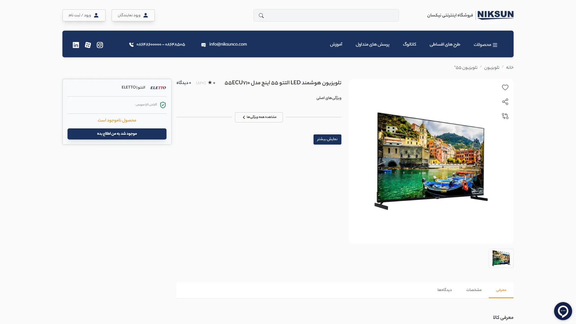
This page is a Product Detail Page (PDP) for a large home appliance online store, implemented with a minimal structure, a solid light background, and a navy blue and gray color palette.
Does the user immediately receive critical purchase and trust information?
A successful product page should make the price, warranty status, and final call-to-action button visible without requiring long scrolls or causing confusion. In the left column, the dedicated purchase card—highlighting the price of 226,512,000 Tomans, the green Kara Service warranty badge, and the high-contrast navy "Add to Cart" button—keeps the decision-making center clear. However, the middle area of the card remains somewhat empty, and the orange "Color selection is required" warning could have used a stronger visual cue to direct the user more effectively to the circular color picker in the center of the page.
How well is the visual presentation of bulky items handled?
For items like double-door refrigerators, different angles and internal views are key factors in a customer's choice. The gallery layout, featuring a large hero image on the right and a row of thumbnails below showing the interior, shelves, and closed angles, provides comprehensive access to physical details. That said, the size of these thumbnails is relatively small compared to the main frame, and adding a floating zoom tool over the product body could more effectively build confidence for hesitant users.
Overall, we have an organized structure, a legible breadcrumb navigation path, and a logical hierarchy between the image and the purchase box. With a bit of optimization regarding the information density in the middle column, it will reach its peak efficiency in converting users into buyers.
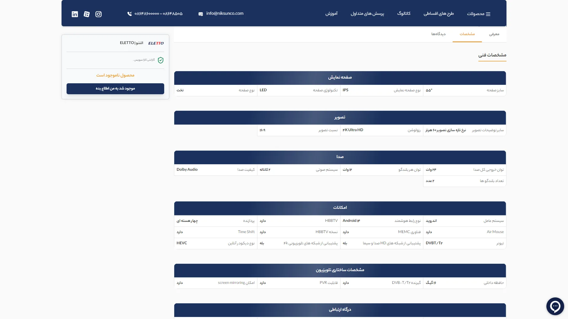
This section shows a preview of the product details page for an online home appliance store, designed with a minimalist approach, a white background, and dark navy as the corporate brand color.
Does the user have quick access to the primary purchase action while scrolling through complex technical specifications?
When selling heavy, specialized goods like refrigerators, separating technical information from the purchase box is crucial to avoid overwhelming the buyer. The layout of the left sidebar—which keeps the price, warranty, quantity selector, and high-contrast
How does the readability of structured data aid in building trust and improving comparison?
An efficient information architecture in the technical specifications table should guide the eye with a steady rhythm toward answers to key questions, such as dimensions and energy grade. The dark header at the top of the table creates a clean organization, but because the separator lines are a very light gray, users may experience visual fatigue or errors when tracking rows such as
Does the reviews and rating section successfully convey a sense of dynamism and social proof?
Validation elements, such as the numerical score and golden stars at the bottom of the page, are powerful psychological triggers for removing buyer hesitation. The placement of the
Overall, by avoiding visual clutter and focusing on the clarity of technical data and the purchasing process, this structure creates a practical and calming balance for a high-value online purchase.
Niksan is an online home appliance store offering products from the brands Niksan, Alteto, Renzo, and Suzuki; from combination and double-door refrigerators to LED televisions and air conditioners. The store features installment purchase modules (plans like Nasiba, Kalano, Vibe, and Jetvām) and a seller panel, with products covered by a valid warranty. I was responsible for supporting and developing the new frontend features of this project — built with HTML, CSS, JavaScript, jQuery, Bootstrap, and PHP Laravel with Blade Template Engine.
Visit the site: niksunco.com/shop