Suniya
Online TV Store
Jun 1, 2025
Support and development of the specialized TV store Sonya; from debugging to new features.
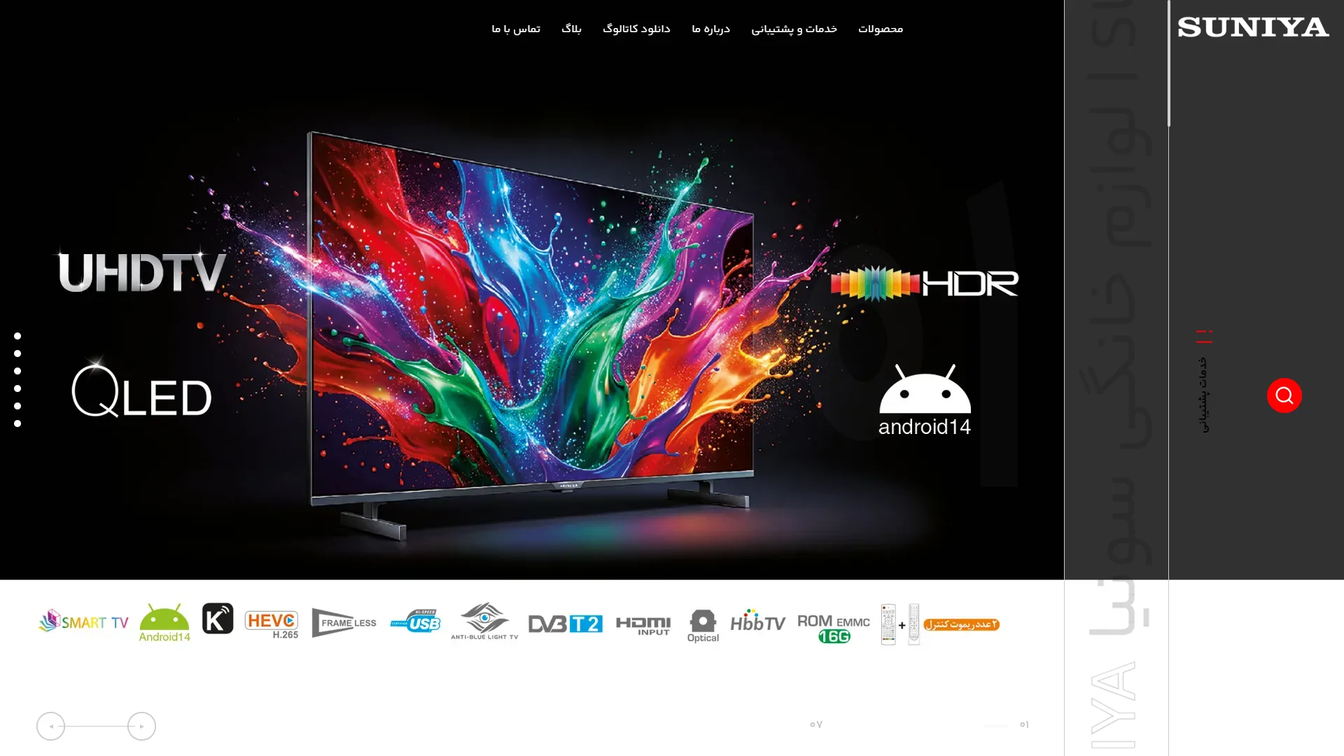
This landing page and hero section for an audio-visual product website uses a dark background to create a modern, sleek, and cinematic atmosphere. The combination of deep blacks with a burst of vibrant colors on the TV screen creates an exceptional visual focus.
Is the visual hierarchy and presentation of key features well-executed?
In a standard electronics design, technical specifications should grab the user's attention at a glance without making the page feel cluttered. Here, technology logos like QLED and Android14 are symmetrically arranged around the display in a legible white font, making the device's hardware capabilities very easy to grasp.
How could the interaction with the vertical menu and navigation be improved in this frame?
Navigation elements must always be accessible so that users can browse the site without confusion. The top horizontal menu is well-spaced, but the right-hand vertical panel with vertical text has poor readability; furthermore, while the red search button offers good contrast, it may go unnoticed at first glance.
Overall, by cleverly utilizing color contrast and precise iconography in the bottom bar, this visual layout successfully conveys a sense of luxury and high product quality.
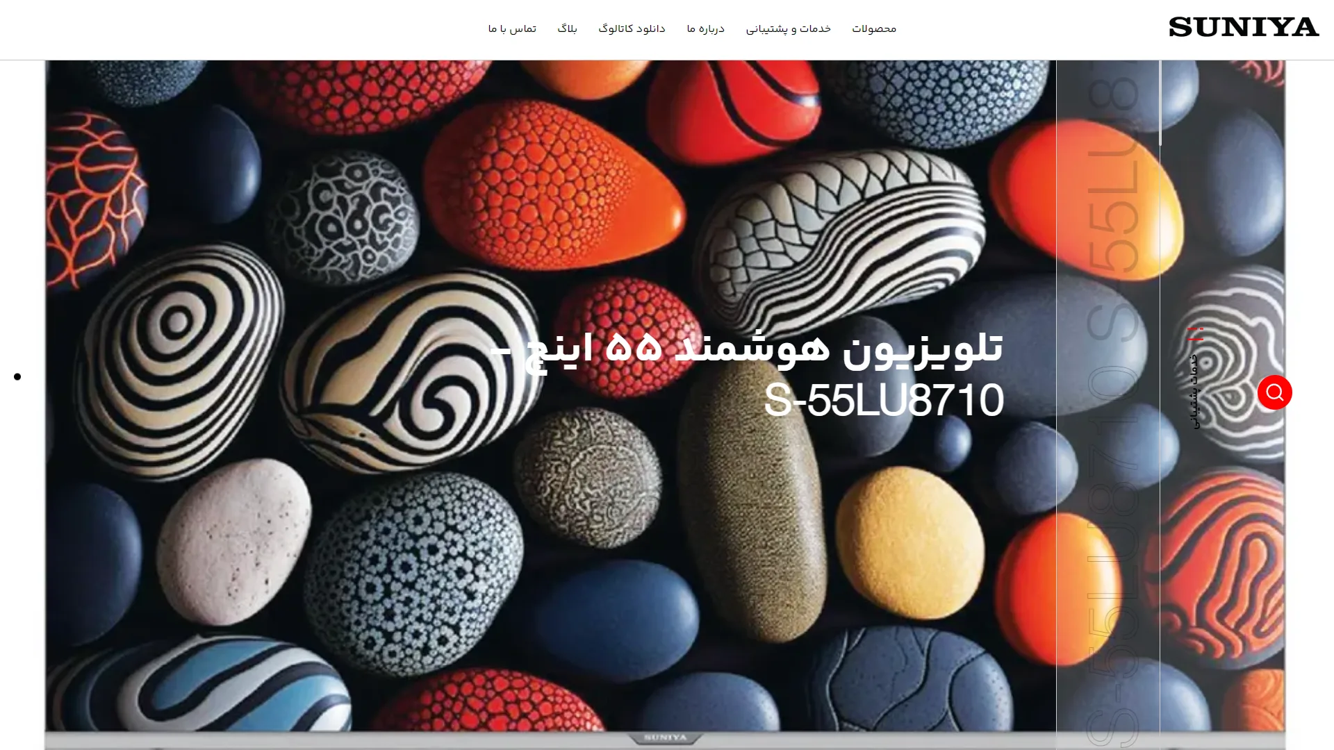
This section is the hero area or header of an industrial and commercial webpage. Using a minimal combination of white, red, and green, it conveys a clean, professional feel tailored to the HVAC (heating, ventilation, and air conditioning) industry.
Is the header and navigation menu clear and functional enough?
A standard navigation menu should allow users to access key sections without wasting time; here, the horizontal layout of options at the top of the page achieves this goal effectively. The branding is prominently placed on the right, with key links such as Products, Services, and Blog alongside it, although adding small visual cues like section-specific icons might have further enhanced overall readability.
How are key product information and competitive advantages displayed in this space?
On a product introduction page, the rapid display of technical specifications and energy efficiency standards is crucial for the buyer to recognize the product's value at a glance. In this section, green energy labels, such as the A++ rating, are clearly positioned next to the model name—all indicative of a smart design aimed at building trust with both industrial and residential customers.
Overall, with its clean layout, clever use of negative space, and emphasis on vital equipment information, this view creates a professional atmosphere fully aligned with modern digital UI design standards.
Sonya is a specialized store for selling TVs. In this project, I was responsible for debugging, developing new features, and technical support. The tech stack includes HTML, CSS, JavaScript, jQuery, and Bootstrap on the front end, and PHP Laravel with Blade Template Engine on the back end.
Visit the site: suniya.ir