Wokin Store
Online store for electric, rechargeable, and industrial tools
May 1, 2025
From drills and concrete mixers to car washes, profile cutters, and generators — a complete store for tools, with installment purchase options.
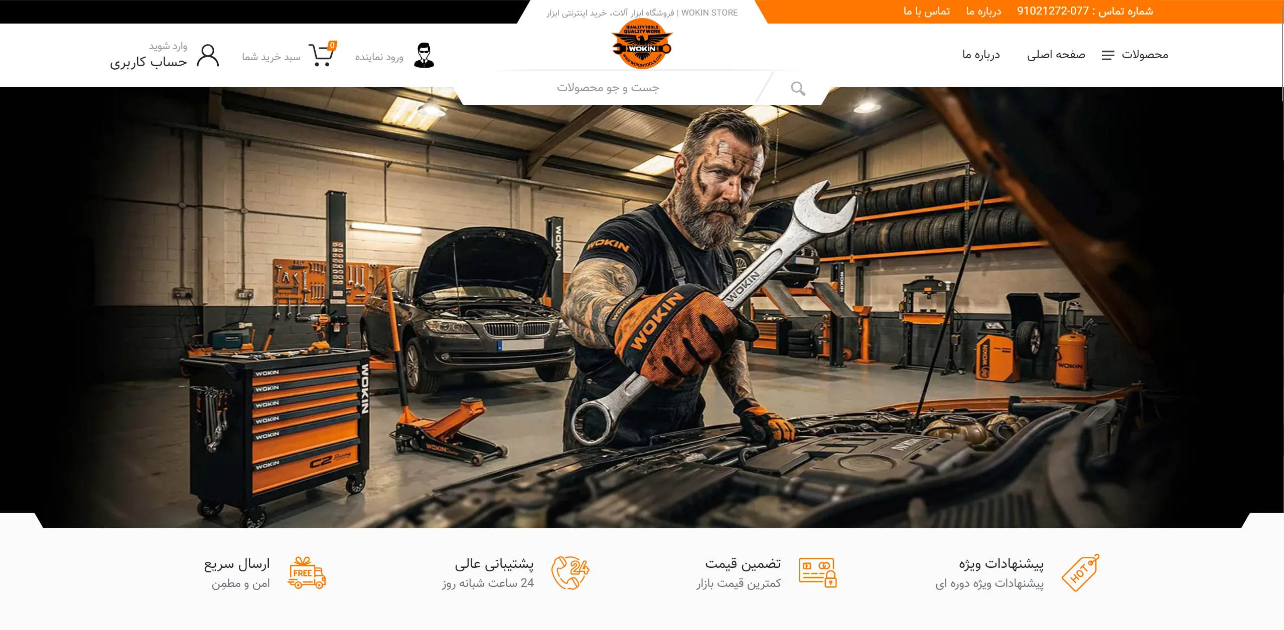
This is the main section and header of a specialized online store for industrial tools, designed with a high-energy identity, a black and orange color palette, and a completely workshop-inspired atmosphere.
How can the imagery of the landing section immediately gain the trust of a technical audience?
On websites for tools and technical equipment, the central imagery must first and foremost convey a sense of power, durability, and practical utility under harsh working conditions to solidify the brand identity in the user's mind. Here, the use of a high-contrast, full-width photo of a professional mechanic in a workshop environment, complete with a toolbox and specialized wrenches, creates a tangible and believable atmosphere that accurately reflects the value of the equipment; however, embedding a clear call-to-action (CTA) button such as "View Tool Catalog" on the banner could have made the conversion path from user to buyer more direct.
To what extent has the navigation architecture and search field placement facilitated access to products?
In stores with a high variety of goods, a well-calculated navigation system must enable the quick location of technical items without confusion. The white geometric cutout that places the "Product Search" field exactly in the center of vision and below the brand logo is an eye-catching solution for grabbing the user's immediate attention, and separating the "Dealer Login" path from the general user account covers the needs of corporate business (B2B); however, strengthening the color contrast of the shopping cart button and the product category menu could have given more clarity to the header's visual hierarchy.
What role does the row of value-added badges at the bottom of the image play in the buyer's decision-making?
To reduce hesitation in online purchases of heavy tools, the direct display of the seller's commitments is one of the critical standards of user experience. The horizontal and balanced layout of four key advantages—including fast shipping, 24-hour support, price guarantee, and special offers—along with linear icons in the corporate color, reduces the psychological burden of the purchase and conveys the necessary peace of mind to the customer in a concise and organized manner.
Overall, by relying on an industrial visual tone, precise color harmony, and direct accessibility, this composition has created an efficient and professional platform for users to enter the tool-buying cycle.
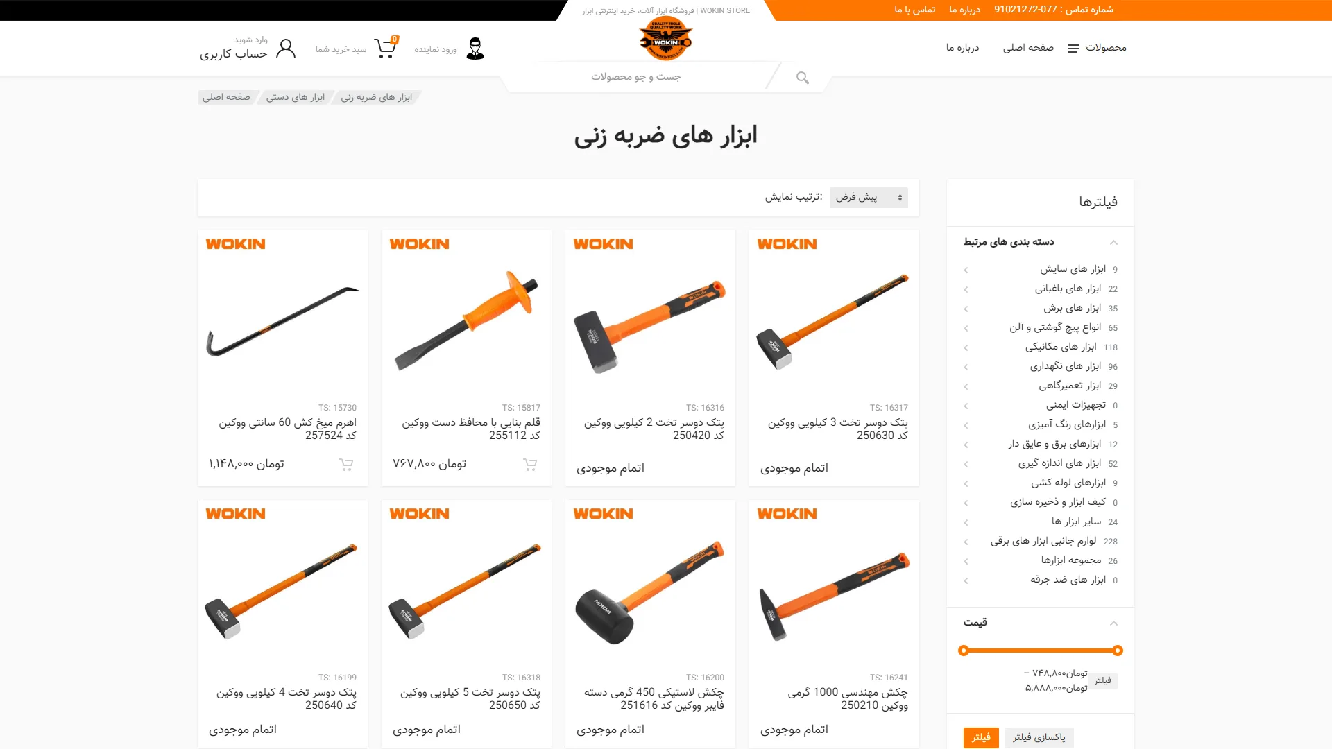
Before us is the category and product listing page of a specialized industrial and hand tool store, designed with a structured grid layout and a strategic use of the corporate orange color. The primary focus of the page is guiding the buyer through a vast array of categories and displaying product cards with maximum clarity.
How can the user's decision-making speed be maximized when selecting technical tools?
In technical tool stores, buyers typically look for numerical data and standard specifications—such as weight, product codes, and lever length—at a glance. Placing specific technical codes, precise dimensions, and clear product names directly above the price tag greatly aids in quickly differentiating similar items, such as multi-kilogram sledges. The use of a consistent white background for industrial product photography also creates high visual clarity, although adding a quick-feature for a direct side-by-side comparison of two tools could have doubled the usability value of this layout.
How well are out-of-stock items and call-to-action buttons implemented?
Clear stock status in catalog pages prevents customer confusion and avoids frustration during the buying journey. This user interface unambiguously shows availability by using the clear phrase Out of Stock; however, the high volume of unavailable items in the top rows highlights the need for a quick filter to display only ready-to-order goods. Additionally, for in-stock products, converting the subtle shopping cart icon into a prominent, colored interactive button would have made the call-to-action significantly stronger.
To what extent do the filters and information architecture meet user search needs?
The right sidebar, providing precise numerical counts next to each subcategory, gives the user a comprehensive overview of product variety, and the price range slider with interactive orange handles offers good budget control. The breadcrumb navigation at the top of the page also keeps the user's exact position within the store hierarchy clear. However, sorting products by "best-selling" or "newest" could have had a more distinct visual presentation than the current dropdown menu to make discovering popular options easier.
Ultimately, this clean composition—with standard spacing between cards and a maintained tool-centric visual identity—creates an organized, straightforward, and reliable experience for professional audiences in this field. The uncluttered page, free from typical promotional noise, demonstrates a respect for the user's focus during the technical review of goods.
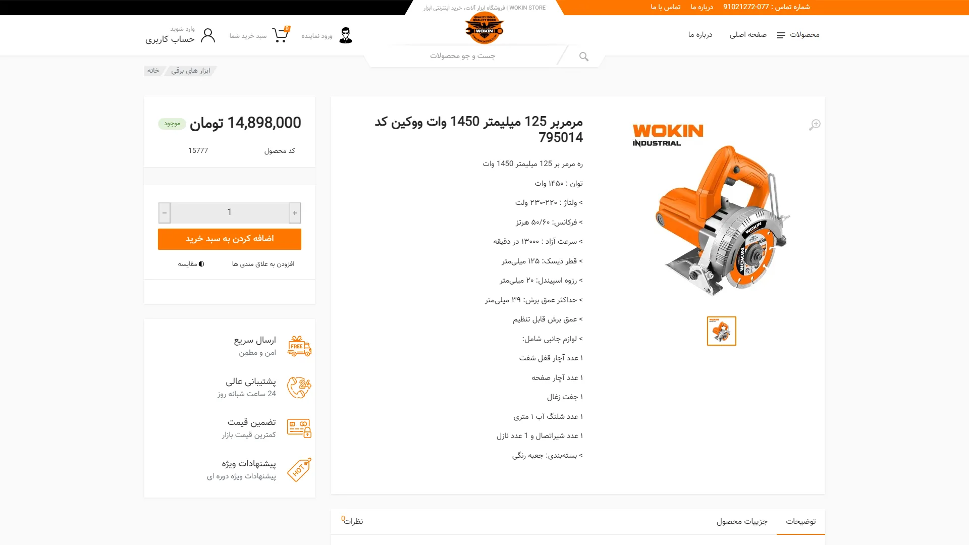
A specialized product detail page designed for industrial tools, presenting complex technical data through a structured and accessible layout. The visual identity, utilizing a light background, ample white space, and a corporate orange accent, creates a clean look tailored to the needs of a technical audience.
How effectively do the specification layout and product gallery simplify the evaluation of technical specs?
In tool sales pages, the ability to simultaneously review technical features and visual details is critical for the buyer. In this structure, organized lists of specifications—such as motor power, no-load speed, and cutting depth—along with the included items list, are positioned centrally next to high-quality product imagery to allow for evaluation without extensive scrolling. The image zoom feature further assists in examining the physical intricacies of the product; however, increasing the line spacing or using a structured table could have made the visual scanning of this data even smoother.
How do the conversion area and order box facilitate the purchasing process?
A successful checkout section must provide quick access to pricing, availability, and final registration steps with maximum clarity. The side panel, featuring a prominent price display, a green availability badge, a quantity counter, and a high-contrast orange Add to Cart call-to-action button, makes the path to purchase entirely explicit. Furthermore, placing value-added icons such as fast shipping, 24-hour support, and price guarantee directly below the order button reinforces buyer trust at the moment of decision.
At the bottom, a segmented tab system for descriptions, details, and user reviews allows for further exploration without cluttering the initial view. Overall, the harmony of the color palette, logical information hierarchy, and emphasis on trust signals make this user interface a straightforward, practical, and reassuring example.
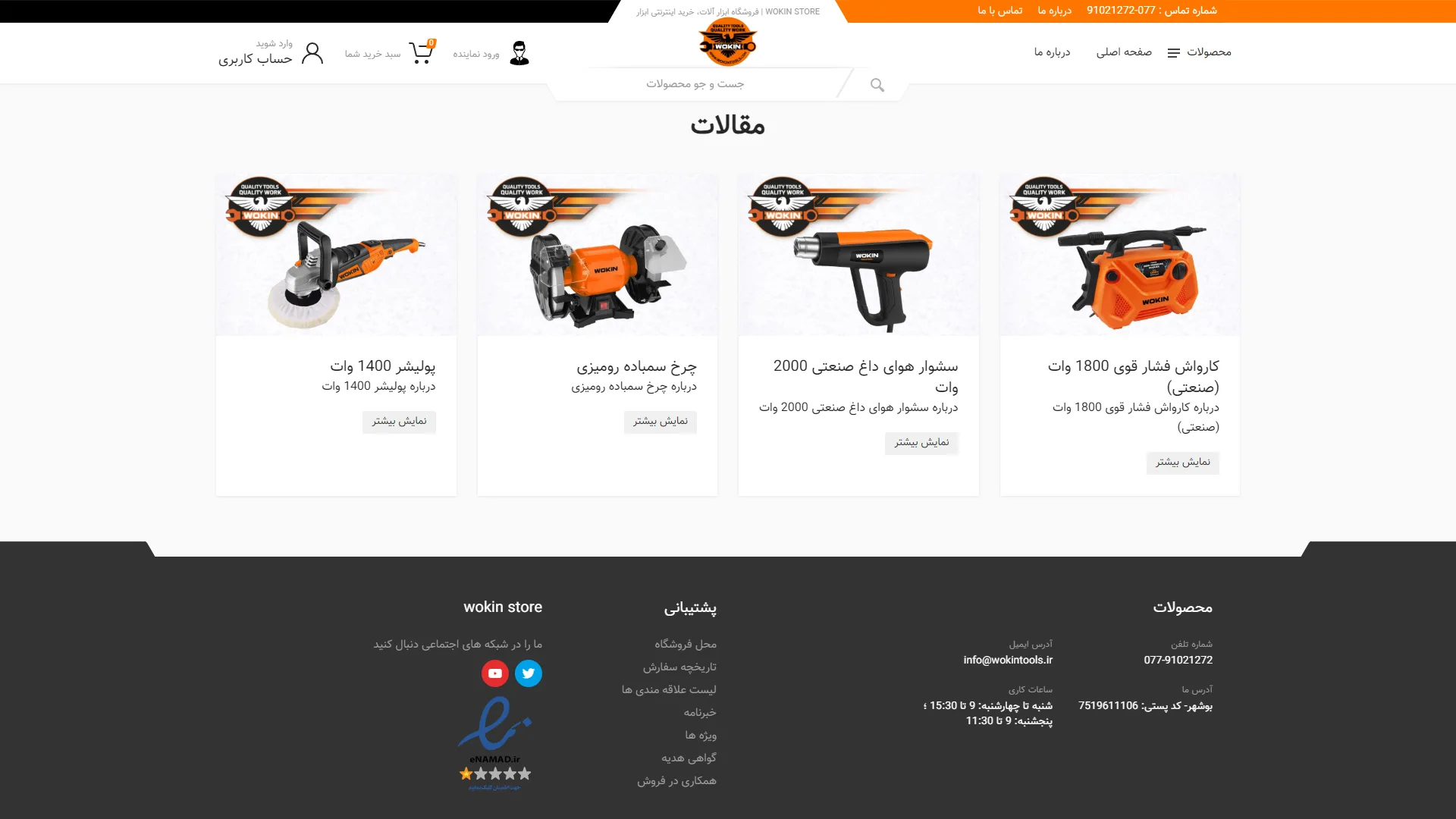
The middle and bottom sections of an industrial tool online store have been designed with a structure based on technical articles and comprehensive footer links. The chosen color palette, relying on corporate orange, black, and a white background, effectively evokes the powerful and dynamic visual identity of the tool industry.
Have the blog cards managed to establish a distinct identity from the product sales section?
In the design of specialized platforms, the blog and articles section should serve as a buying guide and technical training reference, and its visual structure must be separated from the store showcase. In this section, the introduction of tools such as industrial heat guns or high-pressure washers, along with the Show More button, creates a clear path to guide the audience toward deeper content. However, using product images without backgrounds on a white base makes these cards look very similar to a product catalog; adding elements such as reading time, thematic categories, or a text snippet could make the "article feel" of this section much more prominent.
How effective is the footer layout in building trust and providing quick access to support?
A standard footer in e-commerce sites is tasked with resolving the user's final doubts regarding purchase security and communication channels. The dark contrast of the footer creates a clear boundary with the light body of the page, and the columnar categorization of contact information, exact address, and response hours offers a completely transparent structure. Placing the five-star Enamad logo alongside social media communication channels is also an effective step toward gaining the trust of specialized buyers.
Overall, the visual consistency of the top and bottom elements, combined with an organized content hierarchy, has lent a professional structure to the user interface. By upgrading the visual language of the content cards, the balance between the sales and educational sections will reach its peak efficiency.
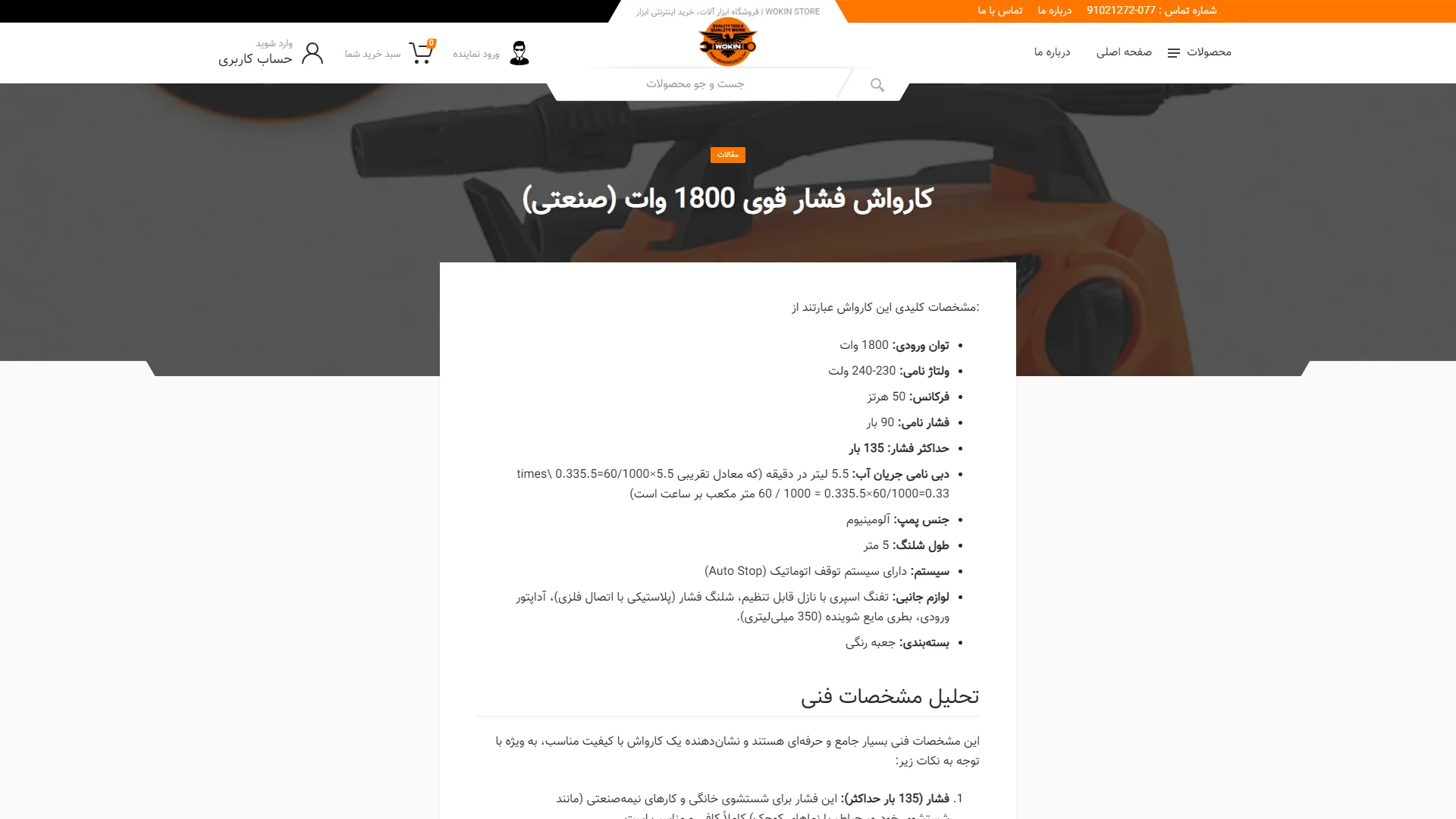
This section showcases the technical review and specialized product article page for an industrial tool store. The corporate color palette of orange, black, and white creates a purely industrial feel that aligns perfectly with the subject matter.
How can heavy technical specifications be presented to the audience in a readable and engaging manner?
On tool review pages, users are typically looking to quickly scan figures such as motor power, operating pressure, and accessories. In this layout, the text content is placed on a seamless high-contrast white box to reduce eye strain and make reading details easier. The separation of specifications using bullet points and clear headings, such as Technical Specifications Analysis, helps the user grasp the topic step-by-step; however, converting this textual data into two-column comparison tables or using graphic icons could have doubled the readability of the numerical parameters.
To what extent has the visual hierarchy of the header and main banner succeeded in guiding the user?
An effective content page design must highlight the review title at first glance while keeping key store navigation paths accessible. The product image against a dark background, combined with the orange Articles label and a bold white headline, effectively captures the user's initial focus. Additionally, maintaining the central search bar, account links, and shopping cart in the top header ensures continuity between the guide content and the final purchase without creating visual clutter.
Overall, with its clean layout, legible typography, and balanced mix of specialized content and navigation features, this structure provides a practical framework for guiding users in choosing the right tool.
Wokin Store is a comprehensive store in the field of tools; it offers electric and rechargeable tools, welding and pneumatic tools, construction equipment, and generators, along with the option of installment purchases through various bank credit plans. I designed this project in a way that its structure can also be used as a base template for similar stores. The user interface is built with HTML, CSS, JavaScript, jQuery, and Bootstrap, while the back-end is implemented on PHP Laravel with Blade Template Engine.
Visit the site: wokinstore.ir