Yegane Store
Online store for gaming consoles and gaming equipment
Feb 1, 2025
A destination for gamers — PlayStation 5, Xbox Series X/S, Nintendo Switch, portable consoles, and various gaming accessories.
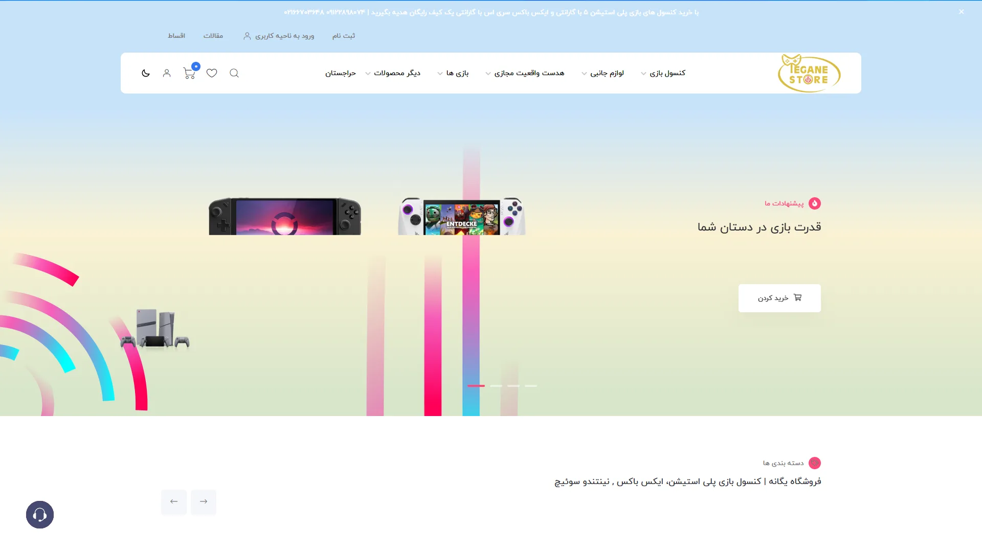
This page is essentially the header and main banner section of a specialized gaming and entertainment online store, designed with a modern feel and a bright color palette. The combination of a soft background, the horizontal layout of the menus, and dynamic graphic elements conveys the excitement and energy of the gaming world to the audience.
Is the main navigation menu clean and functional enough?
In a specialized online store, quick access to various categories is the key to success. In this view, the top menu—with its organized layout and the use of practical icons like the shopping cart and search—makes the user journey very smooth. The fonts are legible, and the spacing between options is adjusted to prevent visual clutter.
How can the appeal of the Hero Section be further enhanced?
The hero section should grab the audience's attention at first glance and showcase the store's primary offer. Here, the use of high-quality console imagery alongside the bold headline "The Power of Gaming in Your Hands" aligns perfectly with the brand's tone. The call-to-action (CTA) button for shopping is sufficiently prominent, although adding more color contrast could drive the click-through rate even higher.
Do the color coordination and visual elements convey the feeling of a modern store?
The background colors are designed as a soft gradient that is easy on the eyes while evoking a sense of modernity. The coordination of the pink icons and decorative light lines on the left adds visual appeal without distracting the user from the main content.
Overall, with its principled layout, appropriate visual harmony, and simple navigation, this landing page creates a pleasant and professional experience for gaming equipment buyers.
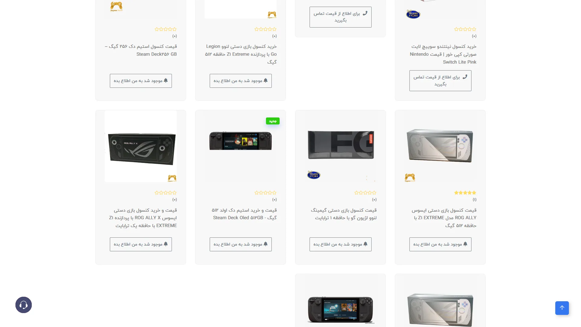
This page is a store catalog or product grid that showcases gaming consoles and accessories in a clean, minimalist fashion using an organized grid layout of product cards.
Does the structure of the product cards effectively capture the user's attention?
In a standard e-commerce design, a product card should convey the price, high-quality imagery, and stock status at a glance to prevent user confusion. Here, the white cards with subtle gray borders and ample whitespace maintain a strong focus on the console images, and the star ratings and product titles are set in a legible font. However, since most products are marked as "Notify me when available," it might have been better to create more visual variety for the items actually in stock.
How can the interaction with buttons and clickable elements be optimized in this layout?
Call-to-action buttons should be prominent enough for the user to know exactly where to click or tap without effort. The use of small bell icons alongside the notification button text in this view is a clever touch, clearly signaling the button's purpose to the user, while the appropriate spacing between cards prevents accidental clicks.
Overall, with its airy layout, high text readability, and organized card structure, this store layout provides a smooth user experience for browsing digital goods.
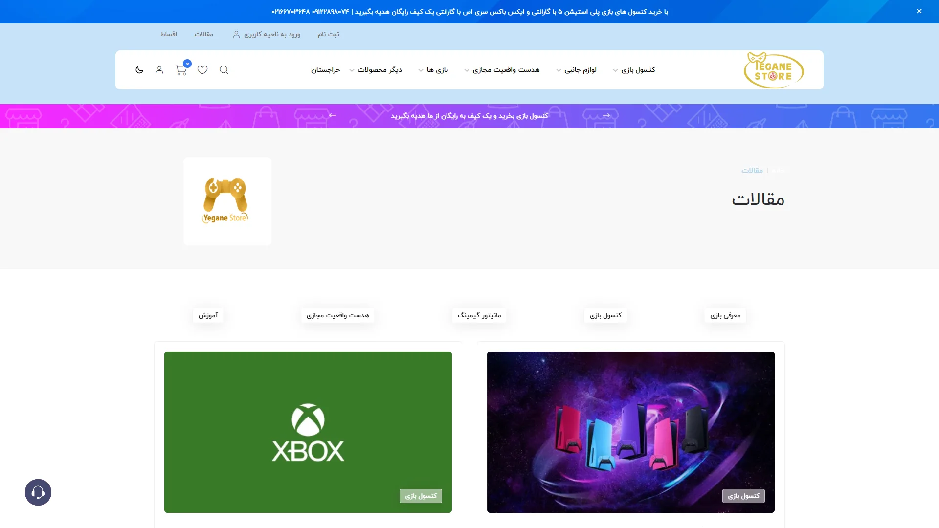
This page, belonging to the articles section of a gaming console and accessories store, features a clean design with a blue and white color scheme to maintain user focus. The site header, with its comprehensive category menu and top promotional banners, effectively implements the standard structure of online stores.
Does the header and navigation bar sufficiently help users find content?
In a standard online store, the header should provide the shortest path to various sections. The use of a horizontal dropdown menu with diverse categories at the top achieves this well; however, the presence of two consecutive promotional banners at the top of the header creates some clutter and detracts from the visual clarity.
How can article categories be made more practical and engaging for the reader?
The articles section of a store is typically arranged with organized content cards and attractive featured images to encourage reading. On this page, the use of large rectangular cards with high-quality images and clear labels at the bottom enhances readability and visual appeal, although the excessive white space at the top of the page could be better utilized with a summary of featured articles.
Overall, this page combines a familiar e-commerce structure that, with a few layout optimizations of the top elements, could provide a smoother and more enjoyable experience for gaming enthusiasts.
Yegane Store is a specialized shop in the gaming world; PlayStation, Xbox, and Nintendo consoles, the latest console games, Meta Quest virtual reality headsets, gaming monitors, and various controllers and accessories. In this project, I worked as a maintenance developer; debugging the frontend, developing new features based on client requests, and providing ongoing support for the store were my main responsibilities in this collaboration.
Visit the site: yeganestore.com